Build an Event Registration Form Template That Converts
Learn practical form optimization strategies in this AgentsForForms guide: Build an Event Registration Form Template That Converts.
Let’s be honest. A clunky, confusing registration form isn't just a minor annoyance—it’s a silent conversion killer that costs you attendees and revenue. The problem usually isn't your event itself. It's the frustrating gauntlet you make people run through just to sign up.
This guide is all about reframing your event registration form template. Stop thinking of it as a simple data-entry tool and start treating it as your first, and most important, interaction with your future attendees.
Your Registration Form Is Costing You Attendees
You know that sinking feeling. You’ve poured money and time into promotion, you've got solid interest, and traffic is hitting your landing page. But the ticket sales are just… flat. More often than not, the culprit is hiding in plain sight: your registration form.

The fallout from a poorly designed form is very real. I’ve seen firsthand how a long or confusing process directly leads to a massive drop-off rate, tanking sales. When organizations track high abandonment rates, the first fix is almost always simplifying the form and asking for less information. You can find more data on optimizing forms over at surveymonkey.com.
The True Cost of a Bad First Impression
Every extra field, ambiguous question, or technical bug adds friction. That friction doesn't just annoy people; it actively shoves them out the door.
Think about these all-too-common scenarios:
- The Overwhelming Questionnaire: A form that demands a dozen details before a user can even see the ticket options.
- The Mobile Nightmare: A layout that’s impossible to navigate on a smartphone without constant pinching and zooming.
- The Vague Error Message: That dreaded red "Error" box that gives zero clues about what's actually wrong.
Each one of these moments erodes a person's patience. It also chips away at their trust in your event's professionalism. The damage isn't just one lost sale; it's a soured perception of your brand before the event even starts.
An optimized event registration form template isn't just about collecting names and emails. It’s about creating a seamless, welcoming, and efficient gateway to your event that boosts conversions, improves the attendee experience, and delivers clean, actionable data from the start.
This guide will walk you through building a template that works for any event, from a simple webinar to a major multi-day conference. We're skipping the generic advice and diving straight into the practical, actionable steps that turn a registration form from a liability into your most valuable conversion asset.
Designing the Core of Your Registration Template
A great registration form isn't about asking every question you can think of; it's about asking only the questions you truly need. I've seen countless event organizers kill their conversion rates by adding just one too many fields. Every single box a person has to fill out is a tiny bit of friction, and that friction adds up.
Think about it from the attendee's perspective. If you're signing up for a free, 30-minute webinar, are you going to bother filling out your phone number, job title, and company size? Probably not. You'll just close the tab. The golden rule is to challenge every field you consider adding: "Is this information absolutely critical to running the event or improving the attendee experience?" If the answer is no, get rid of it.
Essential vs Optional Form Fields
The fields you choose should directly reflect the complexity of your event. A casual local meetup just needs a name and email. A multi-day international conference, on the other hand, has far more complex logistical needs.
To help you decide what's truly necessary, here’s a quick breakdown of how I think about form fields.
| Field Category | Essential Fields (Must-Have) | Optional Fields (Nice-to-Have) | Pro Tip |
|---|---|---|---|
| Contact Info | • First Name • Last Name • Work Email | • Phone Number • Company Name • Job Title | Only ask for a phone number if you have a legitimate, immediate reason to call, like for VIP support. |
| Logistics | • Ticket Type/Level | • Dietary Restrictions • Accessibility Needs • T-Shirt Size | For catered events, dietary questions are essential. For virtual events, they're just noise. |
| Marketing Intel | None are truly essential | • "How did you hear about us?" • Industry • Company Size | The "How did you hear about us?" field provides priceless feedback on your marketing channels. |
| Session Choice | • Session/Workshop Selection | • Emergency Contact | Make this mandatory only if your event involves physical activity or travel where risk is a factor. |
Ultimately, what's essential depends entirely on your event's context. Always start with the bare minimum and add fields only when you can strongly justify their purpose.
My biggest piece of advice: Adopt a 'less is more' mindset. It's the single most effective way to boost form conversions. If a field doesn't serve a clear operational or marketing purpose, cut it. Your abandonment rate will thank you.
The Power of a Multi-Step Layout
Now for a simple trick that can make a huge difference in how your form feels: the multi-step layout. Instead of hitting attendees with a long, intimidating wall of questions on a single page, you break the process into smaller, more manageable chunks. Psychologically, this transforms registration from a chore into a guided, step-by-step conversation.
For example, you could structure your form across three simple screens:
- Step 1: Attendee Info: Start with the easy stuff—just name and email. Once they've entered this, they're already invested in finishing.
- Step 2: Event Details: This is where they can handle things like choosing a ticket type or selecting breakout sessions.
- Step 3: Payment & Confirmation: The final step is reserved for payment. People are much more willing to pull out their credit card once they're already through the first two stages.
A progress bar at the top is non-negotiable here. It visually shows people how close they are to the finish line, which has been proven to dramatically reduce the number of people who give up halfway through. By grouping related questions, you create a cleaner, more intuitive experience that just feels faster.
If you want to get more granular on how to structure the questions themselves, you can explore our guide to different question types in forms.
Building an Intelligent and User-Friendly Form Flow
A great event registration form does more than just collect names. It creates an experience. The goal is to move beyond a static checklist of questions and build a dynamic, almost conversational process that guides each person down a path that makes sense for them. The form should feel smart, like it's anticipating what the user needs before they even have to ask.
This kind of intelligence comes from using features like conditional logic. Instead of hitting every single person with every single question, you can show or hide fields based on their previous answers. It's a game-changer for bigger, more complex events.
Think about a large conference. A registrant checks the box for "Attending Gala Dinner." Boom—a new section instantly appears asking for their dietary preferences. If they had said no, those fields would never have cluttered their screen. This keeps the form clean, relevant, and respectful of their time.
The same principle applies elsewhere. If someone identifies as a "Sponsor," you can automatically prompt them for their company logo and booth requirements. For a deep dive into the nuts and bolts of setting this up, check out our practical guide to using a form builder with conditional logic.
Structuring Your Form for Maximum Completion
How you lay out your form is just as important as the questions you ask. A simple webinar or a small local meetup? A single-page form will probably work just fine. But for a multi-day conference or a festival with dozens of options, cramming everything onto one page is a recipe for disaster. It looks intimidating and is a major cause of form abandonment.
That’s where a multi-step layout saves the day.
This simple flowchart breaks down the decision process.
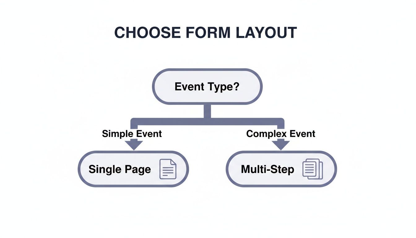
The takeaway is clear: as your event’s complexity grows, so does the need to break the registration process into smaller, more manageable chunks.
By splitting a long form into logical steps—say, "Attendee Info," "Session Selection," and "Payment"—you make the whole process feel less daunting. Add a progress bar at the top, and you’ve turned a chore into a series of small, achievable wins. It's a psychological trick that works wonders for keeping people engaged and moving toward that final "Submit" button.
Polishing the User Experience with Small Details
Beyond the big-picture structure, it's the little things that really elevate the user experience. These details often get overlooked, but they can make a huge difference in your completion rates.
- Be specific with error messages. Nobody likes a vague "Invalid input" error. Instead of just saying "Error," tell them exactly what's wrong. "Please enter a valid email address (e.g., [email protected])" is infinitely more helpful.
- Design for thumbs. Your form absolutely has to work perfectly on a phone. That means big, tappable buttons and fields, a simple single-column layout, and calling up the right keyboard (like the number pad for a phone number field).
- Give feedback in real-time. Don't wait until someone hits "Submit" to tell them they messed something up. As they type, real-time validation can show a little green checkmark next to a correctly formatted email address. This builds confidence and provides positive reinforcement along the way.
A truly user-friendly form is proactive, not reactive. It guides people with clear signals, confirms their input as they go, and adapts to their choices. This attention to detail isn't just about good design; it shows you respect your attendees' time and value their participation.
Integrating Your Form With Your Event Ecosystem
Your event registration form shouldn't be an island. It’s the starting point for your entire event’s data flow, feeding critical information into all the other tools you rely on. Treating the form as just a simple webpage is a huge missed opportunity—its real power is unlocked when you connect it to your other systems.
When you integrate your form, it stops being a passive data collection tool and becomes an active, automated engine for your event. This is how you finally kill off tedious, manual data entry and build a smooth, professional journey for every single attendee after they register.
Automating Your Event Workflow
Think about what happens the moment a new registration comes in. Instead of you having to copy and paste that person's information into a spreadsheet or your CRM, a chain of automated actions can kick off instantly. This isn't just a time-saver; it’s about creating immediate, professional touchpoints with your audience right when they're most engaged.
Here’s what this looks like in the real world:
- CRM Sync: A new attendee's contact info is automatically pushed to your CRM, like HubSpot or Salesforce. Your sales and marketing teams get the data in real-time, ready for follow-ups and building relationships.
- Email Marketing: The registrant is instantly added to a specific list in a tool like Mailchimp, maybe called "Registered for Q4 Summit." This can trigger a welcome email sequence that delivers key event info and builds excitement.
- Team Alerts: When a VIP or an "All-Access Pass" is purchased, a notification zings over to a dedicated Slack channel. Now your team gets real-time alerts on high-value sales, letting them prep for personalized outreach or special welcome gifts.
These automated handoffs are what separate a clunky, disjointed process from a smooth, impressive operation. To see just how far you can take this, you can learn more about our available integrations.
Connecting Payment and Data Systems
If you're running a paid event, your most critical integration is with a payment gateway. Modern forms connect seamlessly with providers like PayPal and Stripe, allowing attendees to buy their tickets securely right within the form itself.
But it goes beyond just payments. The best setups also connect your form to analytics tools, customer databases, and other systems, ensuring all your attendee data is stored securely and in compliance with regulations like GDPR.
Connecting your systems does more than just move data around. It creates a single source of truth about your attendees, slashes the risk of human error, and ensures that every team member is working with the same, up-to-date information.
The end goal is to build an event ecosystem where data flows freely and intelligently between all your tools. This connected approach means that from the moment someone hits "submit," their entire experience—from the confirmation email they receive to the post-event survey they're sent—is cohesive, timely, and completely automated. This is how you scale your event operations without burning out your team, all while making the experience better for your attendees.
Using Real-Time Data to Optimize Your Template
Launching your event registration form isn't the finish line—it’s the starting gun. The real work begins when you start listening to what the data is telling you. This is where you shift from simply building a good form to engineering a high-performance conversion machine, all based on how real people are interacting with it.

Too many organizers get stuck looking at just one metric: total submissions. And while that number is obviously important, it doesn't even begin to tell the whole story. To truly understand performance, you have to dig deeper into the KPIs that reveal user behavior and pinpoint the exact sources of friction.
Key Metrics That Actually Matter
To get a complete picture of your form's health, you need to track a few core metrics. These aren't just vanity numbers; they give you actionable insights into the user experience, helping you identify precisely where things are going wrong.
- Completion Rate: Think of this as your form’s main health score. It’s the percentage of people who start the form and actually finish it. A low rate is a giant red flag that something in the process is broken.
- Abandonment Rate Per Step: If you have a multi-step form, this metric is pure gold. It shows you exactly which page—Attendee Info, Session Selection, Payment—is causing the most people to give up and leave.
- Average Time to Complete: How long is it really taking people to fill this thing out? If it’s significantly longer than you expected, your questions might be confusing, or the layout might just be clunky.
- Field-Level Error Rate: This is as granular as it gets. It identifies which specific fields are triggering the most validation errors, pointing to unclear instructions or confusing formats.
Adopting a data-driven mindset means treating your form not as a static page, but as a dynamic product that can be continuously improved. Small, informed tweaks based on these metrics can lead to significant boosts in sign-ups and revenue.
Turning Data Into Actionable Improvements
Data is useless without action. Let’s walk through a common scenario. Your analytics show a shocking 70% abandonment rate on the payment page. This isn't just a random statistic; it’s a massive sign telling you that your payment process is the bottleneck.
Instead of guessing, you can use this data to form a hypothesis. Is the problem the number of payment options you offer? Is the pricing unclear? Or is there a technical glitch with your payment gateway? This focused approach allows you to A/B test specific changes—like adding a PayPal option or simplifying the credit card input fields—to see what actually moves the needle.
Sometimes, the data reveals issues beyond the form itself. For instance, if completion rates are high but actual ticket sales are low, that often points to a pricing problem, not a design flaw.
This is a fundamental change in how we manage events, where concrete evidence replaces gut feelings. You can discover more insights about analytics-driven event strategies to fine-tune your approach. By listening to what your users are telling you through their actions, you can build a registration experience that not only collects information but actively drives your event’s success.
Got Questions About Your Event Registration Form? We’ve Got Answers.
Even the most seasoned event planners run into questions when building out their registration flow. Let's tackle some of the most common ones I hear from clients to help you iron out those final details.
What's the "Perfect" Length for a Registration Form?
Honestly, there’s no magic number. The real guiding principle here is to be ruthless about only asking for what you absolutely need right now.
For something like a free webinar, a name and email are often all it takes. Anything more is just a barrier. I've seen conversion rates plummet by asking for a phone number on a simple, free event. People just don't want to give it up unless they have to.
On the other hand, if you're running a complex, multi-day conference, you're obviously going to need more info—think session choices, dietary needs, or t-shirt sizes. The trick isn't to make the form shorter, but to make it feel shorter.
The best way to do this is with a multi-step form. By breaking the process into logical chunks—like Attendee Info, Session Selection, and Payment—you make it far less intimidating. Always start with the easy stuff. Once someone has entered their name and email, they're already invested and more likely to complete the rest.
How Do I Make Sure My Form Works on Mobile?
This isn't just a nice-to-have anymore; it's a deal-breaker. A huge chunk of your audience will likely try to register on their phone, probably while multitasking.
The easiest win is to use a modern, responsive form builder. Most good ones, like AgentsForForms, handle the heavy lifting by automatically adjusting the layout for any screen. But there are a few details you should always double-check to nail the mobile experience:
- Stick to a Single-Column Layout: Nobody wants to pinch and zoom on a form. Keep it simple and vertical.
- Use Large Touch Targets: Make sure your buttons, checkboxes, and form fields are big enough for clumsy thumbs. Give them plenty of space to avoid frustrating mistaps.
- Leverage Smart Keyboards: Set your fields up to trigger the right keyboard. A phone number field should pop up the number pad, and an email field should show the '@' symbol. It’s a small touch that makes a huge difference.
And please, always test your event registration form template on an actual phone. Browser emulators are great, but they don't capture the real feel of using the form on a handheld device.
What Are the Must-Have Integrations?
The right integrations can be a total game-changer, turning a manual, clunky process into a smooth, automated workflow. While the "best" ones depend on your specific event, a few are almost always essential.
For any paid event, a payment gateway is non-negotiable. Integrating with a trusted service like Stripe or PayPal is step one.
Next, you need to connect your form to your CRM. Whether you use HubSpot or Salesforce, this integration is crucial for keeping your attendee data in sync and streamlining all your post-event communication.
Finally, an email marketing platform like Mailchimp is a must. This lets you automate confirmation emails, send out event reminders, and follow up with post-event surveys without lifting a finger. Some teams I've worked with also love integrating with tools like Slack or Google Sheets to get real-time registration notifications.
Ready to stop building forms from scratch? With AgentsForForms, you can turn a simple idea into a production-ready, multi-step form with all the smart logic and integrations you need. Ditch the clunky forms that lose you attendees and start converting more visitors today. Create your first form for free at AgentsForForms.