A Guide to Different Question Types in Forms
Learn practical form optimization strategies in this AgentsForForms guide: A Guide to Different Question Types in Forms.
The first step to gathering incredible data isn't about what you ask, but how you ask it. Think of different question types as tools in a toolbox. Each one is designed for a specific job—some are perfect for gathering clean, measurable data, while others are built to capture rich, personal feedback. Choosing the right tool is the secret to unlocking truly valuable insights.
Why Your Choice of Question Type Matters
Building a form is a lot like having a conversation. You wouldn't ask a simple yes-or-no question when you're hoping to hear a detailed story, right? The same logic applies here. The way you frame your questions directly shapes the quality of the answers you get, the user's experience, and ultimately, your form’s completion rate.
When you pick the right format from the get-go, you ensure the data you collect is easy to analyze and act on. For instance, multiple-choice questions standardize responses, making them a breeze to run through for statistical analysis. On the other hand, an open-ended text box can uncover surprising customer pain points or brilliant ideas you never would have thought to ask about.
Aligning Questions with Your Goals
Before you even think about writing a question, you need to be crystal clear on your primary goal. Are you trying to:
- Segment leads for marketing? Dropdowns and multiple-choice questions are your best friends here. They give you clean data points like company size or industry.
- Gather product feedback? You’ll want to use rating scales and long-text fields to measure satisfaction and capture detailed suggestions.
- Register attendees for an event? Date pickers for choosing sessions and file uploads for speaker bios will make the process smooth and efficient.
This decision tree gives you a simple framework for thinking about your data needs before you commit to a question format.
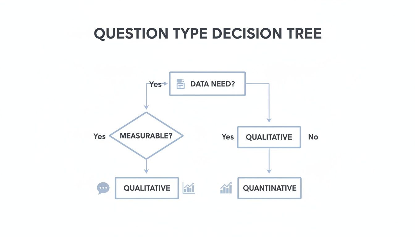
As you can see, the basic choice between quantitative (the "what") and qualitative (the "why") data will steer you toward the most effective question type for the job.
The core principle is simple: structure your questions to make it as easy as possible for users to give you the exact information you need. A well-designed form feels less like an interrogation and more like a helpful, guided dialogue.
Making this strategic choice upfront vastly improves the user's journey, which has a direct impact on your conversion rates. A confusing or frustratingly long form is a top reason for abandonment. By mastering the different question types, you create an intuitive experience that respects the user's time and, in return, gives your team more valuable, actionable insights.
If you want to see how this works in practice, exploring some well-designed pre-built form templates can show you exactly how the experts match question types to specific goals.
Getting Clear Answers with Closed-Ended Questions

If you want data that’s structured and easy to analyze, you need to guide users toward clear, predefined answers. That’s where closed-ended questions come in. They’re the workhorses of any form, acting like guardrails that prevent vague responses and make your data clean from the get-go.
These question types are all about making life easier for your users while delivering reliable data for you. Instead of making someone type out their industry and hoping for the best, you just present them with a neat list. This simple shift minimizes typos, standardizes your data, and makes filling out the form a whole lot faster.
The big three in this category—multiple choice, dropdowns, and checkboxes—each have a specific job. Knowing when to use which is the secret to building forms that people actually complete.
Multiple Choice Questions: The Single-Answer Powerhouse
There’s a reason multiple-choice questions are everywhere. They give a user a list of options and let them pick just one. It’s the perfect format when you need a single, definite answer.
They're brilliant at turning complex decisions into a few simple clicks, which is why you see them all the time in lead qualification forms, demographic questions, and quick preference surveys. In fact, studies show they make up a massive 70% of questions in commercial surveys. For anyone using a tool like AgentsForForms, this is huge—multi-step forms that use branching logic based on these answers can increase conversions by 25-40%. They let you personalize the user’s path and catch errors on the fly. You can dig into more global research insights to see just how effective they are.
You’ll see them used for things like:
- Lead Qualification: "What is your company's size?" (e.g., 1-10 employees, 11-50 employees)
- Demographics: "Which department do you work in?" (e.g., Marketing, Sales, Engineering)
- Simple Segmentation: "What is your primary goal for using our product?"
The beauty of a single-select multiple-choice question is its clarity. There is no room for interpretation, which means the data you collect is incredibly clean and ready for immediate analysis.
Just be careful not to cause decision fatigue. A good rule of thumb is to stick to 5-7 choices. Any more, and you risk overwhelming people. And if your list might not cover every possibility, always toss in an "Other" option.
Dropdowns: Saving Space with Long Lists
Dropdown menus are functionally the same as multiple-choice questions—the user can still only pick one answer. The difference is all about the user interface. They keep the list of options neatly tucked away until someone clicks.
This makes dropdowns your best friend when you’re working with a long, standardized list of answers. Think about asking for a country, a state, or a birth year. Trying to display all 195 countries as radio buttons would create a form that scrolls on for an eternity.
When to Use a Dropdown:
- You have more than seven options.
- The options are standardized and predictable (e.g., days of the week, list of states).
- Screen real estate is tight, especially on mobile.
The only real downside is that users can’t see all the options at once, which adds a tiny bit of friction. If you only have three or four choices, stick with standard radio buttons—it's just more transparent.
Checkboxes: The Freedom of Multiple Selections
Unlike their single-select cousins, checkboxes give users the freedom to pick as many answers as they want from a list. The classic "select all that apply" format is perfect when more than one option could be true.
This question type gives you a much richer picture of your users. For example, asking a new user, "Which features are you most interested in?" with checkboxes provides a multi-dimensional view of their needs—way more insightful than forcing them to pick just one.
Use checkboxes when you need to understand:
- Product Interests: "Which of our product categories are you interested in?"
- Communication Preferences: "How would you like to hear from us?" (e.g., Email, SMS, Newsletter)
- Usage Context: "What devices do you use our software on?" (e.g., Desktop, Tablet, Mobile)
The flexibility of checkboxes is their greatest strength. You get more comprehensive data from a single question, painting a fuller picture of your user without making your form any longer.
Measuring Sentiment and Preference with Scale Questions

Sometimes, a simple "yes" or "no" just doesn't cut it. When you need to understand what people really think and feel, you have to measure the intensity of their opinions. This is exactly where scale questions come in, moving beyond black-and-white choices to capture the rich, nuanced spectrum of human sentiment.
Think of it like adjusting the volume on a speaker. Instead of just on or off, you get a full range from silent to loud. Scale questions do the same for feedback, allowing you to gauge everything from mild satisfaction to passionate loyalty. They are your go-to tools for collecting subjective data in a structured, measurable way.
These question types are perfect for understanding customer satisfaction, getting a read on employee morale, or prioritizing product features based on how important users think they are. Let's break down the two most common formats: rating scales and Likert scales.
Rating Scales: Capturing Quick Impressions
The most straightforward format is the rating scale. You see these everywhere, from the 5-star review on an e-commerce site to the classic 1-10 "How likely are you to recommend us?" Net Promoter Score (NPS) question. They use a simple numerical or symbolic range to quickly capture a user's gut reaction.
Their real power is their simplicity. Everyone instantly gets what a 5-star rating means, making it a low-effort way to collect a high volume of feedback.
Common uses for rating scales include:
- Post-Support Feedback: "How would you rate the support you received today?" (1-5 scale)
- Product Reviews: "Rate this product." (Using stars or hearts)
- Event Feedback: "How satisfied were you with the event?" (1-10 scale)
While they're great for a quick snapshot, standard rating scales can sometimes lack context. A 3-star rating is clearly not great, but why did they give that score? To dig into the reasoning behind the sentiment, you often need a more detailed instrument.
Likert Scales: Measuring Agreement and Intensity
The Likert scale takes things a step further. Instead of just a number, it presents a statement and asks people to indicate their level of agreement on a balanced scale with clearly labeled points. This is your classic "Strongly Disagree" to "Strongly Agree" setup.
This structure is incredibly effective for measuring attitudes and perceptions with far more detail than a simple rating. It’s no surprise that Likert scales now make up 20-30% of questions in modern digital surveys, and their response reliability can be up to 15% higher than simple yes/no formats. Their ability to capture nuanced opinions makes them a staple for serious research. You can explore more insights on how these scales impact global consumer surveys and enterprise feedback.
The core difference is this: a rating scale asks "how much," while a Likert scale asks "how strongly do you agree?" This subtle shift unlocks a deeper level of psychological insight into a user's convictions.
This makes the Likert scale one of the most versatile of all the different question types, ideal for:
- Employee Engagement Surveys: "My manager provides me with constructive feedback." (Strongly Agree to Strongly Disagree)
- Feature Prioritization: "This feature is essential for my workflow." (Essential to Not at all Important)
- Customer Experience Analysis: "The checkout process was simple and easy to navigate." (Very Difficult to Very Easy)
A common debate among researchers is whether to use an odd or even number of points. An odd number (like 5 or 7) provides a neutral middle option, which can be useful but also allows people to sit on the fence. An even number (like 4 or 6) forces a choice, which can give you more decisive data but might frustrate users who genuinely feel neutral. Your choice really depends on whether you want to allow for that middle-ground response.
Finding the 'Why' with Open-Ended Questions
If closed-ended questions give you the structured "what," then open-ended questions are how you discover the all-important "why." These are your free-text fields—the Short and Long Text options—that essentially hand the microphone over to your users. They’re an open invitation to share unscripted thoughts, real feelings, and personal stories.
Here’s a good way to think about it: a multiple-choice question is like a census, telling you how many people live in a house. An open-ended question is like sitting down with them for a cup of coffee to hear what makes that house a home. It's where you find the context, the nuance, and those brilliant, unexpected insights that clean data alone will never give you.
This kind of qualitative data is pure gold. While open-ended questions typically make up only 5-10% of all questions on a survey, they can deliver 40% more valuable qualitative insights by capturing feedback in the user's own words. In the past, sifting through all that text was a huge headache, but modern AI tools have slashed the time it takes to spot trends and patterns. You can dig deeper into how to blend these different survey question types to get the full picture.
Short Text for Quick, Specific Answers
The Short Text field is built for brief, to-the-point information. It's the perfect choice when you need a concise, freeform answer that doesn't fit into a neat little list but is still relatively short. Think of it as your go-to for grabbing unique identifiers or simple data points.
It shows up as a single-line input field, which subtly signals to the user that you're just looking for a quick response. That small design cue is great for managing expectations and helps keep the form feeling fast and easy.
Use a Short Text field for:
- Contact Info: Collecting names, job titles, or company names.
- Unique IDs: Asking for an order number, a discount code, or a username.
- Simple Questions: "What city are you from?" or "Who referred you to us?"
The biggest win here is flexibility. You're not boxing a user into a dropdown of job titles that might not include their actual role. The trick is to pair that flexibility with smart validation rules—for instance, making sure an "Email" field actually contains an "@" symbol—to keep your data clean.
Long Text for Rich, Detailed Feedback
When a few words just won't cut it, the Long Text field (often called a textarea) gives people the space they need to really explain themselves. It appears as a larger text box, a visual welcome mat that invites a more detailed and thoughtful answer. This is where you uncover the rich narratives and detailed explanations that can change your business.
This question type is absolutely critical for any process where deep understanding is the main goal. It lets you collect detailed bug reports, capture in-depth product feedback, or get the full story behind a customer support issue.
By adding a Long Text field, you're sending a clear signal to your users: "We genuinely value your detailed input, and we're here to listen." This alone can dramatically improve the quality of the feedback you get.
Take a support intake form, for example. Asking "Please describe the issue you are experiencing in detail" is infinitely more effective than a restrictive dropdown of common problems. It lets the user explain what’s happening in their own words, giving your support team the crucial context they need to solve the problem fast.
When to use a Long Text field:
- Support Tickets: "Please describe your issue, including any steps to reproduce it."
- User Research: "What's the single biggest challenge you face in your workflow?"
- Feedback Forms: "Do you have any suggestions for how we could improve?"
- Onboarding: "What are you hoping to achieve with our product in the next 90 days?"
The classic challenge with open-ended responses has always been the analysis. But with platforms like AgentsForForms, built-in AI can automatically tag and sort responses, turning what used to be qualitative chaos into structured, actionable intelligence. This makes it easier than ever to tune into the authentic voice of your customer.
Using Advanced Question Types for Complex Scenarios

Once you've mastered the basics, it's time to bring out the specialized tools. Advanced question types are designed to handle more complex information, turning what could be a clunky, confusing form into something smart and intuitive.
Think of these as the precision instruments in your form-building kit. They help you ask sophisticated questions without overwhelming your users, making the entire process feel more like a smooth conversation than a tedious chore.
Matrix Questions for Efficient Grouped Feedback
Let’s say you need someone to rate five different product features on a scale from "Not Important" to "Essential." You could create five separate rating questions, but that would look repetitive and take up a ton of space. This is exactly where the Matrix question shines.
Also known as a grid question, this format packs multiple related questions into a single, organized table. It's a game-changer for the user experience, cutting down on endless scrolling and the mental fatigue of seeing the same scale over and over again.
When to use a Matrix question:
- Feature Prioritization: Let users rate the importance of several features in one go.
- Employee Surveys: Evaluate different aspects of job satisfaction (like work-life balance, management, and compensation) using a consistent scale.
- Post-Event Feedback: Gather ratings on multiple speakers or sessions within a single, easy-to-scan grid.
Just a heads-up for mobile users: a wide matrix can be a pain to navigate on a small screen. It's best to limit the number of columns to keep the layout clean and responsive for everyone.
File Uploads and Date Pickers for Practical Needs
Some of the most useful question types are the ones that solve everyday data entry problems, ensuring you get accurate information without frustrating people.
A File Upload field is a must-have anytime you need documents, images, or other files. Think job applications (resumes), support tickets (screenshots), or expense reports (receipts). It saves everyone the hassle of follow-up emails and keeps all the necessary info tied to one submission. When you set one up, always specify the allowed file types and size limits to prevent errors.
The Date/Time Picker is another hero for user experience. Instead of making users guess the right format (MM/DD/YYYY? DD-MM-YY?), a simple calendar interface lets them point and click. This is crucial for:
- Scheduling appointments or demos
- Registering for events
- Entering birthdates or project deadlines
By providing an interactive calendar, you kill frustrating validation errors before they happen and guarantee your data is perfectly standardized from the start.
Conditional Logic to Create Dynamic Conversations
Now for the real powerhouse: Conditional Logic. This isn't just a question type—it's a feature that turns your static form into a smart, personalized conversation.
Conditional logic, or branching, shows or hides questions based on a user's previous answers. If someone says "Yes" to a question, a new set of relevant follow-ups can appear instantly. If they say "No," those questions stay hidden, saving them from irrelevant clutter.
This simple "if-then" principle is the secret to reducing form abandonment. By showing people only what's necessary, you create a shorter, more relevant experience that can dramatically boost your completion rates.
It's the magic behind the smartest forms. For example, a registration form might ask, "Do you have any dietary restrictions?" If the user clicks "Yes," a text box appears for details. This is so much more elegant than having a "Dietary Needs" field that’s always visible and usually left empty.
This approach is key to building effective multi-step forms that guide users on a tailored path. You can see how this works in practice by checking out these high-converting multi-step form examples. Better yet, in AgentsForForms, setting up this logic is completely code-free, letting you build these intelligent pathways in minutes.
How to Build a High-Converting Form
Knowing your question types is one thing, but arranging them into a form that people actually want to complete is a whole different ballgame. A high-converting form isn’t about flashy features; it’s about creating a smooth, logical journey that respects the user's time.
Think of it less like an interrogation and more like a conversation. A great form guides users from one field to the next without making them stop and think. The real secret is to strategically combine question types to hit your goal, whether you’re generating leads, collecting feedback, or registering people for an event.
Best Practices for Form Conversions
To put this all into practice, here’s a checklist that I've seen work time and time again. Each of these points is designed to tackle a common reason people abandon forms, helping you fix the leaks in your conversion funnel.
- Start with Easy Questions: Always kick things off with simple fields like name or email. This builds momentum. Save the heavier, more personal questions for the end, once you’ve earned a bit of their trust.
- Logical Question Order: Group related questions. All the contact info should be in one block, and all the project details in another. This just feels more natural and organized to the user.
- Show Progress: If your form has more than one page, a progress bar is non-negotiable. It manages expectations and gives users a sense of accomplishment, showing them the light at the end of the tunnel.
- Use Conditional Logic: Nothing kills momentum like an irrelevant question. Use logic to show or hide fields based on previous answers. This creates a personalized, much shorter path for each person.
- Mobile-First Design: A huge chunk of your audience is on their phone. Make sure your form is truly responsive, with big, easy-to-tap buttons and text that doesn’t require pinching and zooming.
A Real-World Example: Lead Generation
Let’s say you're building a lead gen form for a SaaS company. The goal is to qualify potential customers without scaring them away with a wall of questions.
- Step 1: The Hook: Start with a single Short Text field asking for their "Work Email." It's a low-effort first step that gets them in the door.
- Step 2: Qualification: Next, use a Multiple-Choice question for "Company Size" and a Dropdown for "Industry." This gives your sales team clean, structured data to work with.
- Step 3: The 'Why': Add an optional Long Text field: "What's your biggest challenge with [your solution area]?" This is where you strike gold and uncover real pain points.
The core idea is that a well-built form feels like a helpful dialogue. It respects the user's time by only asking for what’s necessary at each stage, guiding them seamlessly toward completion.
By thoughtfully combining these question types, you create an experience that not only gathers better data but also leaves a great first impression. For a deeper dive, check out our complete guide on how to create online forms that actually convert.
Got Questions? We've Got Answers
Even when you know all the different question types inside and out, tricky situations always pop up during the actual design process. Let's tackle some of the most common questions we hear from teams on the ground.
How Many Questions Is Too Many?
There isn't a single magic number here. The real goal is to find that sweet spot between getting the information you need and not exhausting the user. A solid rule of thumb? Only ask for what you absolutely need to get the job done right now.
For a simple newsletter sign-up, 3-5 fields is probably your limit. But if you're building a detailed project intake form, 10-15 questions might be necessary. The key is to make it feel logical. People are willing to fill out a longer form if every single question makes sense and clearly moves them toward their goal.
Your form should be as long as necessary, but as short as possible. If a field doesn't directly help you achieve your goal, get rid of it.
What's the Real Difference Between a Checkbox and a Radio Button?
This one trips people up all the time, but the distinction is simple and super important for a good user experience.
- Radio Buttons are for "one and only one" answers. Think of a classic "Yes" or "No" question. You can only pick one.
- Checkboxes are for "pick all that apply." This is perfect for questions like, "Which of these topics are you interested in?" where multiple answers are welcome.
Using the wrong one is a surefire way to confuse users and mess up your data. It's a small detail that makes a huge difference.
How Do I Actually Get More People to Complete My Form?
Getting that form completion rate up is all about smart design and respecting the user's time. It's not one big thing, but a bunch of small, thoughtful improvements.
Here are a few tactics that work wonders:
- Use Conditional Logic: Don't show people questions that don't apply to them. When the form adapts based on their answers, it feels shorter, smarter, and custom-built for them.
- Add a Progress Bar: If you have a longer, multi-page form, a progress bar is a must. It shows people the light at the end of the tunnel and tells them exactly how much they have left to do.
- Make it Mobile-Friendly: Your form has to work flawlessly on a phone. That means big, easy-to-tap buttons and text you can read without pinching and zooming.
At the end of the day, a high completion rate is the result of making the entire process feel effortless for the user.
Ready to build smarter forms that actually get filled out? With AgentsForForms, you can turn a simple idea into a polished, multi-step form in just a few seconds. It comes with AI-generated copy, built-in validation, and the analytics you need. Start building for free at AgentsForForms.