Analysis of Surveys A Guide to Unlocking Actionable Insights
Learn practical form optimization strategies in this AgentsForForms guide: Analysis of Surveys A Guide to Unlocking Actionable Insights.
Survey analysis is how you turn a pile of raw feedback into smart, actionable insights that can actually drive your business forward. It's the process of cleaning up, organizing, and digging into survey responses to find the trends, patterns, and stories hidden within the data.
Why Survey Analysis Is Your Business Superpower
Trying to make business decisions without data is like driving blindfolded. You might get somewhere eventually, but you're probably going to hit a few walls and take a lot of wrong turns. Think of survey analysis as your GPS—it transforms a jumble of opinions into a clear, reliable map for growth.
This isn't just a technical task; it's the art of listening to your audience at scale. When you systematically break down the feedback you receive, you stop guessing and start making choices based on solid evidence.
Turning Feedback into Forward Momentum
Every single survey response is a clue. One person complaining might just be having a bad day, but when 20% of your respondents all bring up the same problem? That's not noise; that's a signal pointing to a major friction point you need to address. This is the real magic of survey analysis: it helps you find the signal in the noise so you can focus on what really matters.
Here’s how this superpower helps different teams:
- Product Teams: It highlights which features customers genuinely love and which ones are just causing headaches, giving you a clear direction for your product roadmap.
- Marketing Teams: Analysis uncovers the exact words and pain points your customers use, which is pure gold for crafting messages that resonate and campaigns that convert.
- HR Professionals: It gives you a real pulse on how your team is feeling. We have a whole guide on how to measure employee satisfaction and boost morale if you want to dive deeper.
From Raw Data to a Strategic Roadmap
Let's say you've just collected hundreds of responses from a customer satisfaction survey. Without analysis, all you have is a spreadsheet filled with random ratings and comments. But once you start analyzing it properly, you can answer the big questions:
- Are all the customers with a low Net Promoter Score (NPS) complaining about the same thing?
- Is there a link between how long someone has been a customer and how happy they are?
- What are the common themes popping up in the open-ended comments about our support team?
The goal isn't just to collect data—it's to have a conversation with it. Good analysis lets you ask smarter questions and get answers that point directly to opportunities for improvement and innovation.
Ultimately, mastering survey analysis turns feedback from something you react to into a proactive engine for growth. To make sense of your findings more efficiently, a dedicated Survey Analyzer can help you get to the insights faster. This way, you can be sure every decision is guided by the authentic voice of your audience.
Preparing Your Data for Meaningful Analysis
Raw survey data, fresh from the field, is never ready for analysis right out of the box. Think of it like raw ingredients before a chef starts cooking—everything needs to be washed, sorted, and prepped. This critical step, often called data cleaning or data preparation, is what turns a chaotic jumble of responses into a reliable foundation for your findings.
Trying to analyze messy data is a surefire way to get flawed conclusions. No matter how fancy your analysis techniques are, the old saying holds true: garbage in, garbage out. The goal here is to create a clean, structured dataset that genuinely reflects what your respondents told you.
The journey from gathering opinions to building a strategic plan hinges on this analytical work, as you can see below.
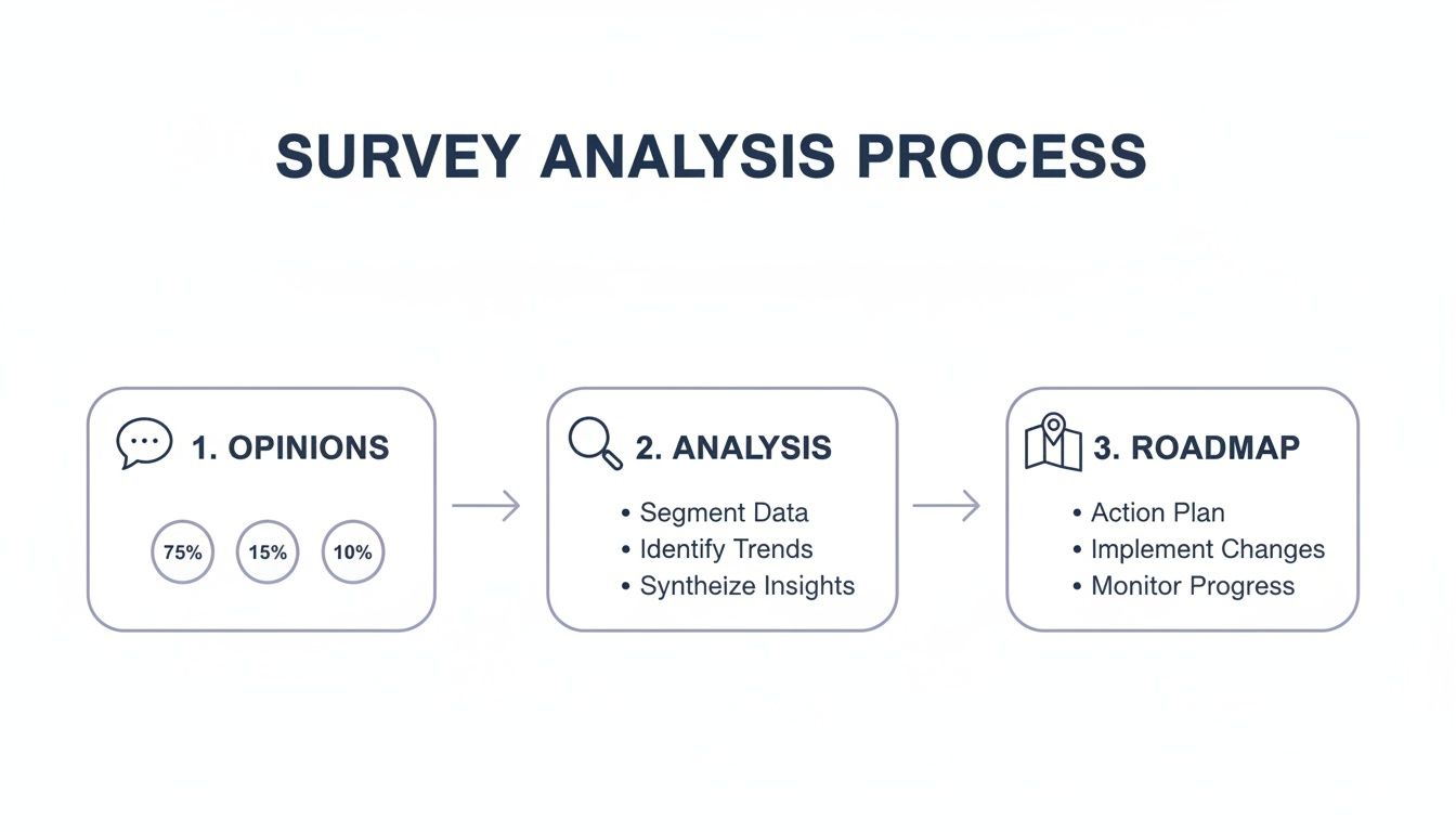
Analysis is the essential bridge connecting what people think with what your business does next.
The Nitty-Gritty of Data Cleaning
First things first, you have to weed out the entries that will throw off your results. This means hunting down and dealing with duplicates, half-finished surveys, and even pesky bot submissions. Just a handful of bad responses can completely distort your averages and send you in the wrong direction.
Once the junk is gone, it's time to standardize everything. This is especially crucial for open-ended text fields where the same answer can be written in a dozen different ways.
Before you can dig into the data for insights, you have to roll up your sleeves and get it into shape. Here’s a look at the most common tasks and why they're so important.
Essential Data Cleaning Tasks and Their Impact
| Task | Description | Why It Matters for Analysis |
|---|---|---|
| Handling Missing Values | Deciding how to treat incomplete surveys. This could mean removing the response entirely or just excluding it from specific calculations. | Leaving too many gaps can lead to a smaller, less representative sample size. Ignoring them can produce misleading averages and totals. |
| Removing Duplicates | Finding and deleting identical submissions, which often happen due to network glitches or a user clicking "submit" twice. | Duplicate entries artificially inflate your numbers, making certain responses seem more popular or common than they actually are. |
| Standardizing Data | Unifying entries to ensure consistency. For example, grouping "USA," "U.S.A.," and "United States" into a single category. | Without standardization, you can't accurately count responses. "USA" and "U.S.A." would be treated as two different answers, skewing your results. |
| Checking for Outliers | Spotting extreme or nonsensical answers, like someone entering "99" on a 1-to-5 scale or "N/A" in a numeric field. | Outliers can dramatically skew statistical calculations like averages and standard deviations, giving you a distorted view of the typical response. |
Spending time on these steps isn't just busywork; it's what makes your final conclusions credible and trustworthy.
A clean dataset is the bedrock of credible survey analysis. Time spent here prevents rework and builds confidence in your conclusions, ensuring that the story your data tells is accurate and trustworthy.
How to Tame Open-Ended Responses
Numbers are one thing, but what about all those open-ended text answers? This is where a process called coding comes in. It's less about programming and more about acting like a detective—reading through qualitative feedback and sorting it into meaningful themes.
For instance, if you see comments like "the website is slow" and "pages take forever to load," you could group them under a new category called "Performance Issues." This smart step transforms unstructured text into data you can actually count, revealing which themes are most common. While you can do this by hand for smaller surveys, AI-powered tools are getting really good at automating this, saving you a ton of time.
Of course, the quality of your insights starts long before you clean the data—it starts with a well-built survey. You can dive deeper into this topic with these survey design best practices for high-quality data. Once your dataset is clean and organized, you're finally ready for the fun part: uncovering what it all means.
Decoding the Numbers with Quantitative Analysis
Alright, your survey data is prepped and ready to go. Now for the fun part: making it talk. This is where quantitative analysis comes in. It's all about using statistical methods to make sense of the numerical data you've collected—all those ratings, rankings, and multiple-choice answers.
Think of it as translating raw numbers into a clear, compelling story about what your audience truly thinks and does. We're moving beyond just counting responses to uncover the "what" and "how many" in your feedback. This gives you the hard evidence needed to back up your decisions.
Starting with the Basics: Descriptive Statistics
Your first stop in any quantitative analysis is getting the lay of the land with descriptive statistics. These are simple calculations that give you a bird's-eye view of your data, summarizing the typical response across the board. They don't predict the future; they just tell you what you’ve got.
The three go-to measures here are:
- Mean: This is just the good old-fashioned average. If your average customer satisfaction score is 4.2 out of 5, that’s the mean. It’s a single, powerful number that sums things up nicely.
- Median: The middle value. If you lined up every response from lowest to highest, the median is the one sitting right in the center. It’s super useful because it isn’t thrown off by a few extremely high or low outliers.
- Mode: Simply the most popular answer. If more people chose "Strongly Agree" than any other option, then "Strongly Agree" is the mode. It instantly points to the most common sentiment.
These figures give you a solid baseline. A marketing team, for instance, might see that the mode for their "How did you hear about us?" question is "Social Media." Boom—right away, they've identified a critical channel.
Finding Hidden Connections with Inferential Statistics
Descriptive stats are great for a snapshot, but the real magic happens with inferential statistics. This is where you dig deeper to find relationships between different data points and even make educated predictions. It's about reading between the lines.
A cornerstone technique is correlation analysis, which looks at how two variables move together. It helps answer questions like, "Do customers who rate our support highly also tend to spend more?" or "Is there a link between an employee's department and their job satisfaction?"
A strong correlation doesn't automatically prove that one thing causes another. But it's a huge clue that two things are connected, pointing you toward areas that are worth a closer look.
Imagine a product team finds a strong positive correlation between customers using a new "Dashboard" feature and higher Net Promoter Scores (NPS). That insight is gold. It suggests the feature is a big hit and a key driver of loyalty, which could easily justify pouring more resources into its development. You can get even more granular by segmenting this data with customer details, which you can learn more about in our guide on what a demographic question is and how to use it right.
This level of analysis turns a simple survey into a strategic compass, showing you exactly what moves the needle. If you want to go beyond basic calculations and reveal subtle patterns you might otherwise miss, specialized AI data analysis tools can automate complex work and help turn your numbers into a clear roadmap.
Uncovering the Story Behind the Data with Qualitative Analysis
Quantitative analysis gives you the hard numbers—the "what." But to truly understand your audience, you have to dig into the "why." That's where qualitative analysis comes in, focusing on the rich, open-ended text responses that are often the most valuable part of any survey.
These text-based answers are where the real stories are hiding. They contain the specific frustrations, unexpected delights, and nuanced opinions that neat-and-tidy numbers just can't capture. If you're only looking at multiple-choice answers, you're missing out on a goldmine of insight.

With qualitative data, you’re not calculating averages. You’re on the hunt for patterns, emotions, and the kind of context that brings your quantitative findings to life.
Finding Patterns with Thematic Analysis
The most common way to make sense of all that text is thematic analysis. Think of it like organizing a messy closet. You start with a big pile of individual comments and start sorting them into meaningful groups based on their core idea or theme.
This process involves reading through responses and tagging them with keywords. For example, comments like "the checkout process was confusing" and "I couldn't find the payment button" could both be tagged under the theme "Payment Friction."
As you work your way through the data, you’ll start to see which themes pop up most often. This approach transforms hundreds of individual comments into a handful of clear, actionable insights, showing you exactly where you need to focus your energy.
Understanding Emotion with Sentiment Analysis
Beyond just identifying topics, you need to understand the emotion behind the words. Sentiment analysis is a technique that helps you classify text as positive, negative, or neutral. It's a quick way to get a read on the overall feeling associated with a particular theme.
Knowing that 30% of comments mention your new feature is interesting. But knowing that 90% of those comments are negative? That's a game-changer. It adds a critical layer of emotional context that demands attention.
Qualitative analysis adds color to the black-and-white world of quantitative data. It ensures the voice of your respondent—their tone, emotion, and specific language—is not lost in the pursuit of statistical summaries.
By combining thematic and sentiment analysis, you can build a much richer picture. You might discover that mentions of "customer support" are overwhelmingly positive, while comments about "shipping times" are predominantly negative. This lets you celebrate what's working and urgently fix what isn't.
A Real-World Example in HR
Let's see how this plays out. An HR team runs an annual employee engagement survey and includes an open-ended question: "What is one thing we could do to improve your experience here?" They get back over 500 individual comments.
- Thematic Coding: Manually or with an AI tool, they start grouping the responses. They create themes like "Career Growth," "Work-Life Balance," "Management," and "Office Amenities."
- Quantifying Themes: After coding everything, they find that "Career Growth" is the most frequently mentioned theme, appearing in 42% of responses.
- Sentiment Analysis: Looking closer at that theme, they see the sentiment is overwhelmingly negative. Comments include things like "I don't see a path forward here" and "promotions feel random."
The numbers told them engagement was down, but the qualitative analysis told them why: a perceived lack of growth opportunities is the main thing driving down morale. Now they have a clear, specific problem they can start solving.
The manual process of coding can be incredibly time-consuming, especially with large datasets. Thankfully, modern tools are increasingly using AI to help automate thematic and sentiment analysis. This helps you pull these powerful stories out of your survey data in a fraction of the time, making sure the authentic voice of your audience adds powerful context to your numbers.
How to Visualize and Report Your Survey Findings
So you've done the hard work of analyzing your survey data. But here's a tough truth: an insight buried in a spreadsheet might as well not exist. The final, and arguably most critical, step is to turn all those numbers and text snippets into a clear, compelling story that actually gets people to act. This is where good data visualization and sharp reporting make all the difference.
Your goal isn't to dump a mountain of data on your stakeholders; it's to guide them through it. A well-designed chart can communicate a complex finding in seconds, while a poorly chosen one just creates more questions than answers. Think of this final presentation as the bridge connecting your raw data to real, tangible business decisions.

Choosing the Right Chart for Your Data
Fight the urge to default to a pie chart for everything. Different kinds of data tell different stories, and they need the right visual format to be heard clearly. Picking the right chart is the first, crucial step toward building a narrative that makes sense.
Here are a few workhorse chart types and what they do best:
- Bar Charts: These are your go-to for straightforward comparisons. Perfect for showing which option in a multiple-choice question was most popular or for comparing satisfaction scores across different customer segments.
- Line Charts: Nothing beats a line chart for showing trends over time. If you run the same survey every quarter, this is how you'll visualize whether customer satisfaction is climbing or employee morale is dipping.
- Heat Maps: Got a lot of variables? Heat maps are brilliant for spotting patterns in complex data. An HR team could use one to instantly see how engagement scores break down across different departments and seniority levels at the same time.
- Word Clouds: A surprisingly powerful tool for making sense of qualitative data. The size of each word reflects how often it was mentioned, instantly surfacing the most common themes from all those open-ended responses.
The right chart doesn't just show data; it makes the key takeaway jump off the page.
Good reporting isn't about showing stakeholders everything you found. It’s about showing them what they need to see—the most critical insights that demand their attention and action.
Building a Narrative with Your Survey Report
A great survey report is more than a collection of charts and graphs. It tells a story. It needs a clear beginning (the "why"), a middle (the "what"), and an end (the "what now") that walks your audience through the entire journey.
Structure your report to build understanding one step at a time. A simple, effective flow looks like this:
- Executive Summary: Lead with the punchline. This is for your busiest stakeholders. In just a few sentences, state the survey's goal, who you talked to, and the top 2-3 most important findings and recommendations.
- Key Findings: This is the heart of your report. Dedicate a slide or section to each major insight. Start with a bold headline that states the finding (e.g., "73% of New Users Struggle with Onboarding"). Then, show the chart that proves it, and add a few bullet points of context or a powerful quote from a respondent.
- Recommendations: Here’s where you connect the dots. Based on your findings, what should the business do next? Make your suggestions specific, practical, and directly tied to the data you just presented.
- Appendix: All the nitty-gritty details—like your survey methodology, the full list of questions, and raw data tables—should live here. This keeps your main report clean and focused but gives anyone who’s interested a path to dig deeper.
By framing your analysis this way, you stop being just a data reporter. You become a trusted advisor who guides the team toward smarter, more informed decisions.
Real-World Workflows for Product, HR, and Marketing
Knowing the theory is great, but putting it into practice is where you really see the payoff. Let's walk through how different teams—from product to HR to marketing—turn survey analysis into smarter, data-backed decisions that actually move the needle.
These workflows are all about turning raw feedback into concrete action.
Product Management: Closing the Customer Feedback Loop
For any product manager, customer feedback is the lifeblood of a solid roadmap. A sharp survey analysis workflow makes sure the voice of the customer doesn't just get heard, but directly shapes what gets built next.
Here’s how that typically plays out:
- Launch a Feature Feedback Survey: Right after a new release, you push a targeted in-app survey. You ask users to rate the feature on a 1-5 scale and leave some open-ended comments about their experience. Simple.
- Segment the Responses: Now, here's the key: don't treat all feedback the same. You need to slice and dice the data. Segment the quantitative results by user plan (think Free vs. Enterprise) and user tenure (newbies vs. power users). You might quickly discover that your power users absolutely love the new feature, while new users are completely lost.
- Code the Qualitative Data: It's time to dig into those open-ended comments. Using thematic analysis, you start spotting patterns and grouping feedback into themes like "Usability Issues," "Missing Functionality," and "Positive Performance Feedback."
- Prioritize and Act: The data paints a clear picture. While the overall satisfaction score is a mediocre 3.2/5, the theme "Usability Issues" is mentioned by a whopping 80% of new users who gave a low score. That’s your signal. The next development sprint shouldn't be about adding more bells and whistles; it should be laser-focused on improving the onboarding and UI for this feature.
HR: Uncovering What Employees Are Really Thinking
HR pros lean on engagement surveys to keep a finger on the pulse of company culture and morale. When done right, this analysis becomes a powerful tool for keeping your best people and shaping strategy.
For instance, an annual engagement survey isn't just about getting a single score. It’s about breaking it down to find what truly drives satisfaction. A recent study, for example, highlighted that 65% of employees now tie their job satisfaction directly to mental health support—a huge jump from previous years. You can discover more insights from the Randstad Workmonitor to see just how much these expectations are changing.
A practical HR workflow might look like this:
- Deploy an Anonymous Pulse Survey: Ask direct questions about things like workload, management support, and career growth opportunities.
- Cross-Tabulate the Data: Compare engagement scores across different departments, office locations, and job roles. This might reveal that the engineering team's scores are 15% lower than the company average, pointing to a localized problem.
- Analyze Open-Ended Comments: You dive into the engineering team's written feedback and find a recurring theme: "unclear project goals."
- Develop an Action Plan: Armed with this specific insight, HR can partner with engineering leaders to implement clearer project management frameworks. You're no longer just reporting a problem; you're fixing the root cause.
By connecting the 'what' (low scores) with the 'why' (unclear goals), HR moves from simply reporting on problems to actively solving them.
Marketing: Fixing the Leaks in Your Lead Funnel
For marketers, every lead form is a mini-survey. Analyzing how people interact with your forms—and where they give up—is critical for boosting conversion rates and getting better quality leads.
This screenshot shows an AI-powered form builder that can create surveys with smart logic.
Tools like this give you real-time analytics to pinpoint the exact moment a potential lead decides to bail.
Let's imagine a marketing team is staring at a 50% drop-off rate on their "Request a Demo" form. Ouch.
- Analyze Field-Level Drop-Off: The analytics show a clear pattern: most people abandon the form when they get to the "Company Size" and "Annual Revenue" fields.
- Formulate a Hypothesis: The team suspects these questions feel too intrusive for someone just kicking the tires. It’s a reasonable guess.
- Run an A/B Test: They create a second version of the form. This time, they completely remove the "Annual Revenue" field and make "Company Size" optional.
- Measure and Iterate: After just one week, the new form shows a 30% increase in completions. This is a huge win. The analysis led directly to a simple change that significantly boosted a core marketing metric. This cycle of analyzing, testing, and iterating is the heart and soul of conversion rate optimization.
Common Questions About Survey Analysis
As you start digging into your survey results, you’ll inevitably run into a few tricky questions. Everyone does. Whether you're second-guessing your sample size or trying to make sense of conflicting feedback, getting these things right is what separates a good analysis from a great one.
Let's walk through some of the most common hurdles teams face. Think of this as a practical field guide to help you turn that pile of raw data into a clear, confident story.
How Big Does My Sample Size Really Need to Be?
Ah, the million-dollar question. The honest, non-academic answer is: it depends. While a bigger sample size usually gives you more confidence that your findings reflect the whole group you care about, you don't always need to survey thousands of people.
Getting the number right comes down to three things:
- Population Size: Are you surveying a small, known group (like your 50 enterprise customers) or a massive, undefined one (like all online shoppers)? For the smaller group, you'll need a much higher percentage of them to respond to get a reliable picture.
- Confidence Level: How sure do you need to be that your results aren't a fluke? A 95% confidence level is the industry standard. It basically means you can be 95% certain that if you ran the survey again, you’d get similar results.
- Margin of Error: How much wiggle room can you live with? A 5% margin of error is typical. If your survey says 60% of people love a feature, this means the actual number is probably somewhere between 55% and 65%.
For most business surveys, the goal is to find that sweet spot—statistically significant but not overkill. If you're unsure, an online sample size calculator can give you a great starting point.
What Do I Do When My Numbers and Comments Don't Match?
It happens all the time. The numbers show a high satisfaction score, but the open-ended comments are a minefield of complaints. It feels like your data is broken, but it's not.
Don't panic. This discrepancy isn't a problem; it's an opportunity.
When your quantitative and qualitative data seem to be telling two different stories, it usually means a small but passionate group has something important to say. Their feedback is a gift—it’s an early warning system for a problem the rest of your user base might not have hit yet.
Instead of throwing one set of data out, use it to guide your investigation. Try filtering the negative comments to see which user segments they're coming from. You might find that all the complaints are from a specific group whose pain points, once solved, could prevent a much bigger issue from brewing.
How Can I Speed Up My Survey Analysis?
In a fast-moving business, insights that arrive weeks late might as well not arrive at all. To get faster, you need the right process and the right tools. Think about the big real-time sentiment studies you see in the news, like a global Ipsos predictions survey that found 71% of people felt optimistic about the year ahead. They don't wait for months to publish those results.
You can bring that same sense of immediacy to your own work. By using tools with live dashboards and analytics, you can watch trends take shape as the responses roll in. This flips survey analysis from a slow, backward-looking exercise into a dynamic, real-time conversation with your audience.
Ready to build smarter surveys and get insights faster? AgentsForForms is an AI-powered form builder that turns your ideas into production-ready forms in seconds. Create dynamic surveys with branching logic, analyze results in real-time, and integrate feedback directly into your workflows. Start building for free at AgentsForForms.