How to Create Online Forms That Actually Convert
Learn how to create online forms that people will actually complete. This guide covers smart design, AI-powered building, logic, and optimization.
When you break it down, creating a decent online form seems simple: figure out your goal, build it, test it, and publish. But the reality is that most online forms are just plain bad. They’re clunky, confusing, and they kill conversions.
Why Most Online Forms Fail to Convert
Let's be blunt: nobody wants to fill out a form. It’s a task, a means to an end. So, before we jump into the "how-to," we need to get to the heart of why so many forms get abandoned. The problem isn't usually a technical bug—it's almost always a failure of human-centered design.

The moment someone sees your form, they're doing a quick mental cost-benefit analysis: "Is what I'm getting back worth the time and effort I'm about to put in?" Every single field, every confusing label, and every moment of doubt pushes them closer to saying, "Nope, not worth it."
The Anatomy of Form Friction
I call this "form friction"—anything that makes the process slower, harder, or feel a bit sketchy. Think of it as the digital version of standing in a long line at the DMV only to be handed a confusing clipboard of paperwork. Once you know what to look for, the common culprits are painfully obvious.
- Excessive Length: The biggest conversion killer, hands down, is a giant wall of questions. People see it and their brains just shut down.
- Ambiguous Questions: Fields with vague labels like "Details" or "Information" are just lazy. They force the user to guess what you want, which leads to frustration and garbage data for you.
- Lack of Trust: Asking for a phone number or company revenue right at the start without explaining why you need it feels invasive and immediately triggers suspicion.
- Poor Mobile Experience: If someone has to pinch and zoom just to tap into a field on their phone, you've already lost them. This is an instant dealbreaker for a massive chunk of your audience.
The golden rule of form design is to respect the user's time and attention. Make it easy, make it clear, and make it trustworthy. Every single field must earn its place on your form.
Mobile Experience Is Not Optional
Here's a tough truth: the mobile conversion gap is real and it's costing you. Even though over 70% of the world uses mobile devices, our own analytics consistently show that desktop users complete forms at a much higher rate. It’s not just us—one study found an 84% user preference for filling out forms on a desktop, with a measly 3% preferring mobile.
This data screams one thing: if you aren't designing and testing for a mobile-first experience, you are actively throwing away conversions. If you're curious, you can explore more data on user form preferences to see just how wide this gap is.
The good news is that we can fix this. Modern form design tackles these problems head-on. Multi-step flows break long forms into digestible chunks, conversational language makes it feel less like an interrogation, and conditional logic ensures people only see questions relevant to them. This approach turns a chore into a simple, guided conversation—setting the stage for a form people will actually complete.
Planning Your Form with a Clear Purpose
Great forms don’t just happen. They’re the result of careful, upfront thinking. Before you even touch a form builder or debate button colors, the real work begins: nailing down your form's one, single, absolute goal. Skip this step, and you end up with a bloated, confusing mess that frustrates people and gives you garbage data.
Every form needs one primary job. Are you trying to pull in qualified sales leads? Get feedback on a new feature? Sign people up for a webinar? Trying to do all three at once will tank your results. A form designed to capture a hot sales lead looks completely different from one built for a quick customer support ticket.
This single purpose is the lens through which you should view every single decision that follows, from the questions you ask to the words you choose.
Define Your Single Most Important Goal
Start with a deceptively simple question: "What is the one thing I absolutely need the user to do after they hit submit?" Your answer to this question will light up the entire path forward.
Let's say you're a SaaS company offering product demos. Your goal isn't just to get any submission; it's to get a qualified one. This means your form needs to be smart enough to separate a high-value enterprise lead from a small business owner who’d be better off with a self-serve plan. Here, the form's real job is to filter and route, not just to collect names.
Now, contrast that with an event registration form. The goal there is much simpler: get the person signed up with the least amount of friction possible. Every extra field asking for their job title or industry is another chance for them to get annoyed and leave. The goal is completion, plain and simple.
Map the User Journey First
Once you have your goal locked in, fight the urge to start listing questions. Instead, take a minute and put yourself in your user’s shoes. What information are they expecting to give you? What’s going to feel natural, and what’s going to feel like an interrogation?
Context is everything. Where is the user coming from? A super-targeted ad on LinkedIn? A blog post about industry trends? This context clues you in on their mindset. Someone clicking a "Request a Demo" button is mentally prepared to share business details. Someone signing up for a newsletter? Not so much.
The best way to build a form is from the outside in. Start with what the user expects and is willing to give, then work backward to what you need. Most people do it the other way around, and that's why their forms get abandoned.
This whole process helps you draw a hard line between need-to-have and nice-to-have information. For that SaaS demo form, company size and the person's role are probably need-to-haves. Their favorite project management tool? That’s a classic nice-to-have you can ask about later in the sales process. Be ruthless about cutting anything that doesn't directly serve your form's primary goal.
Use AI to Accelerate Your Structure
Planning doesn't have to mean staring at a blank page for hours. This is a perfect spot to bring in AI tools like AgentsForForms to get the ball rolling fast. Instead of starting from scratch, you can give it a simple prompt and get a logical structure in seconds.
For example, you could try a prompt like this:
Design a multi-step lead form for a SaaS demo, prioritizing enterprise lead qualification. The first step should be low-friction, asking only for a work email.
An AI form builder can take that and instantly spit out a structured, multi-step flow. It gets the nuance behind "low-friction" and "enterprise qualification," suggesting a sequence that builds trust as it goes. It might start with just the email, then move on to company size and role, and only ask for a name and phone number at the very end.
This strategy leans on a proven psychological trick: once someone completes a small first step, they're far more likely to see the whole process through. Using AI here saves you hours of guesswork and makes sure your form is built on a solid, conversion-focused foundation right from the start.
Turning Your Plan into a Real Form (The Smart Way)
Alright, you've got a solid plan. Now it's time for the fun part: bringing that plan to life. This is where your user flow diagrams and data point wishlists become a real, clickable form that people will actually use.
In the past, this meant dragging and dropping every single field, one by one. You’d spend ages tweaking labels, setting up validation rules, and just hoping you didn’t miss anything. It was slow, tedious work. Thankfully, we don't have to build forms that way anymore. AI has completely changed the game.
Instead of building from scratch, you can now generate a complete, production-ready form from a single, well-written prompt. This isn’t just about being faster; it’s about starting from a much better place. The AI handles the grunt work, so you can jump straight to refining and perfecting the experience.
From a Simple Idea to a Finished Form
Let's say you're on the marketing team, and you need a lead capture form for a new ebook. You know you want to keep it simple upfront to avoid scaring people away.
Your prompt could be as straightforward as this:
Create a friendly, multi-step form for an ebook download about AI in marketing. Start with just a work email to reduce friction, then ask for first name, company size, and biggest marketing challenge on the next step.
An AI tool like AgentsForForms takes that and runs with it, instantly building the entire multi-step flow. But it's not just creating empty boxes. It's injecting intelligence right from the start.
- It writes the copy for you. The AI knows to use clear, conversational labels and placeholder text. So instead of a generic "Name," you get something more human, like "What's your first name?"
- It names your fields logically. For easy data management on the backend, it will automatically use clean field names like
first_nameorcompany_size. Your data team will thank you. - It adds smart validation rules. The AI automatically applies the basics, like making sure an email address actually looks like an email address or marking key fields as required.
This process gets your first draft about 80% of the way there in seconds. It saves a ton of manual effort and bakes in best practices from the get-go.
This is what it looks like in AgentsForForms—just type what you need, and the form appears.
The big shift here is moving from a builder to a director. You're no longer laying every brick; you're just telling the AI what kind of house to build.
A Real-World Example: Fixing Customer Support Intake
Think about a customer support team drowning in poorly filled-out tickets. Their current form is a giant, single-page monster that confuses users, leading to submissions with crucial information missing. They need a form that actually helps users give them the right details.
Here’s a prompt they could use:
Build a multi-step customer support form. First, ask for their name and email. Then, have them choose their issue type from a dropdown: 'Billing Question,' 'Technical Issue,' or 'General Feedback.' If they select 'Technical Issue,' show an extra step asking for their browser and operating system.
The AI immediately understands this and builds a form with conditional logic—what we often call branching—built right in. A user with a billing question will never even see the fields for browser and operating system. This creates a much smoother, more relevant experience for the user and delivers cleaner, better-structured data to the support team.
By letting AI handle the initial build, you're essentially getting an expert-designed form without hiring an expert. The system already knows how to ask good questions, structure a logical flow, and apply validation rules that prevent garbage data from ever reaching you.
Fine-Tuning Your AI-Generated Form
Once the AI has given you that incredible head start, you step in to apply the finishing touches. This is where your human expertise shines, and it's the perfect partnership: machine efficiency paired with your strategic oversight.
The foundation is there, so you can quickly:
- Tweak the copy: Adjust the tone of the questions to make sure it sounds exactly like your brand.
- Add or remove fields: Maybe you realize you also need to ask for a phone number, or that one question isn't really necessary. Easy.
- Customize the look and feel: Change up the colors, fonts, and layout so the form feels like a seamless part of your website.
Think of the AI as a brilliant junior team member who drafts the entire project for you. It handles all the time-consuming structural work, freeing you up to focus on the high-level strategy and final polish. This workflow doesn’t just save you time; it results in a much better, higher-converting form from the moment you publish it.
Using Advanced Logic and Smart Integrations
A static form that just collects data is a massive missed opportunity. The real magic happens when your form becomes a dynamic, intelligent starting point for a bigger workflow. By building in logic and connecting it to other tools, you transform it from a simple data bucket into a smart system that adapts to users and automates your work.
This is where your form starts working for you. It can intelligently filter leads, personalize a user’s journey, and kick off a dozen different actions the moment someone hits "submit." This isn't just a nice-to-have; it's how you turn raw submissions into real business intelligence.
This decision tree, for example, shows how a single AI prompt can branch into distinct, purpose-built forms for completely different teams—marketing and support.
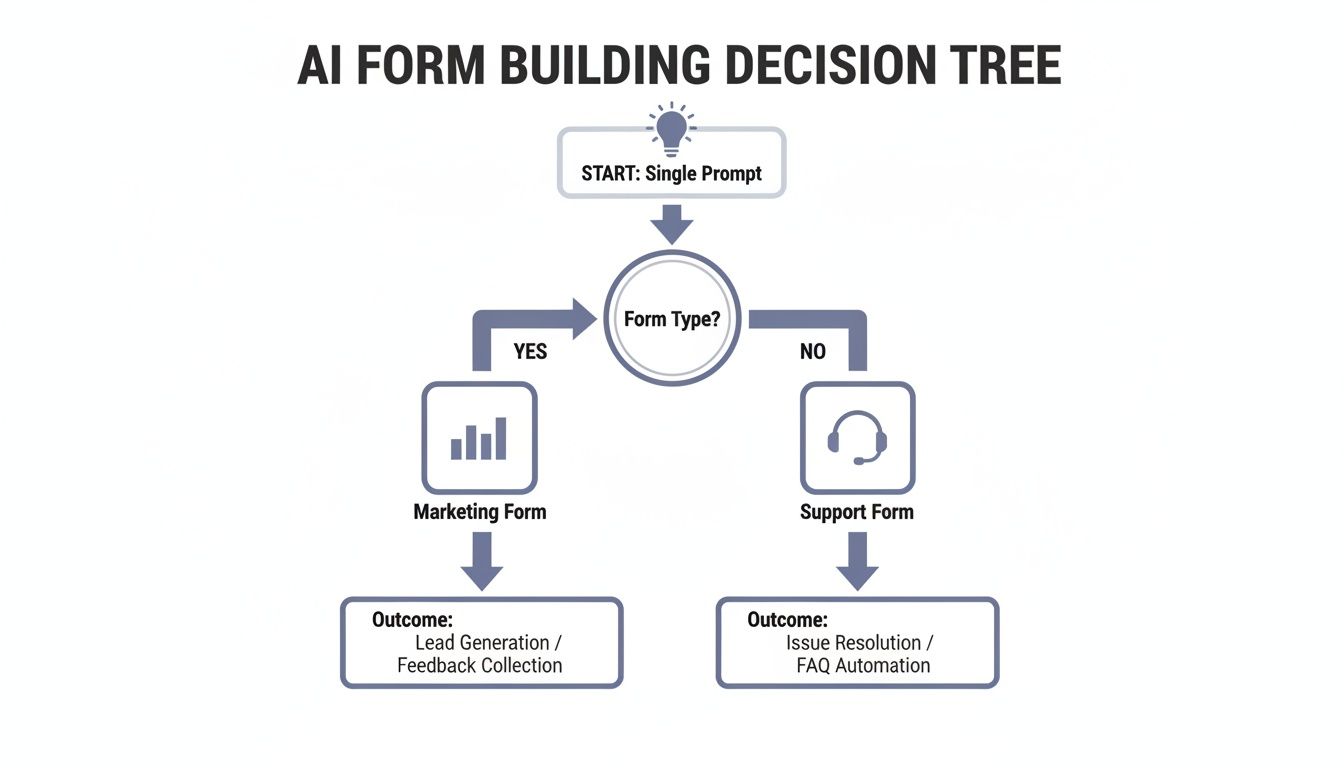
The takeaway here is that modern form creation isn't linear. It uses logic to direct outcomes, making sure the right questions get asked to meet a specific goal.
Making Your Form Adapt With Conditional Logic
Conditional logic, often called branching, is the secret to making a form feel like a conversation instead of an interrogation. It allows your form to show, hide, or skip questions based on how someone answered a previous one, creating a unique path for each person. This respects their time and dramatically improves the user experience.
Imagine you're building a registration form for a conference with different ticket types. Instead of blasting every attendee with the same long list of workshop options, you can use logic to tailor the experience.
- If a user selects the "VIP Pass," the form can instantly reveal a few exclusive questions about their dietary preferences for the VIP dinner.
- If they choose a "Student Pass," it might skip the workshop section entirely and jump right to payment.
This simple branching makes the form shorter and far more relevant. For a sales lead form, this is even more powerful. If a prospect indicates their company size is "Enterprise," you can immediately show fields asking about their procurement process or security requirements—questions you’d never ask a small business.
Conditional logic turns a one-size-fits-all questionnaire into a personalized journey. It’s the single best way to reduce form fatigue and gather higher-quality, more specific data from different user segments.
Connecting Your Form to Your Workflow
A form should never be a data silo. Its true value is unlocked when the information it collects flows seamlessly into the other tools your team relies on every single day. This is done through integrations, which act as bridges between your form and your favorite apps.
Setting up integrations means a new submission can trigger automated actions across your entire tech stack. No more manually downloading CSV files or copy-pasting data from one system to another. This saves an incredible amount of time and, more importantly, slashes the risk of human error.
Modern form builders like AgentsForForms make this surprisingly easy, often offering direct connections to hundreds of popular tools right out of the box.
Choosing the Right Integration for Your Workflow
Deciding how to connect your form to other tools depends on what you need to accomplish and your team's technical comfort level. Here's a quick rundown of the most common options.
| Integration Type | Best For | Example Use Case | Setup Complexity |
|---|---|---|---|
| Direct Integration | Simple, high-frequency tasks involving popular apps (e.g., Slack, Google Sheets, CRMs). | Sending a notification to a Slack channel the moment a new lead comes in. | Low |
| Automation Platform | Multi-step workflows involving several different apps that need to pass data between each other. | When a form is submitted, create a CRM record, add them to an email list, and create a task for a sales rep. | Medium |
| Webhooks | Custom-built workflows, connecting to proprietary systems, or triggering server-side scripts. | Sending submission data to a custom internal database to update inventory in real-time. | High |
Whether you start with a simple direct connection or a complex webhook, the goal is the same: get data where it needs to go, automatically.
Common Integrations and How to Use Them
Let's look at a few practical examples of how these connections can automate your work:
- Slack Notifications: Instantly ping your
#sales-leadschannel the moment a high-value prospect fills out your demo request form. This lets your team follow up in minutes, not hours. - Google Sheets: Automatically log every submission as a new row in a spreadsheet. This is perfect for tracking event registrations, survey responses, or customer feedback in one organized place.
- CRM Syncing: Create or update a contact in your CRM (like Salesforce or HubSpot) as soon as a new lead comes in. The form can pass along all the crucial details—company size, specific interests, you name it—directly to the lead's profile.
For more technical teams, webhooks offer almost limitless flexibility. A webhook is basically a notification that your form sends to another application whenever a submission comes through. You can use them to trigger custom scripts, update a database, or kick off complex workflows in automation platforms like Zapier or Make. This is how a simple online form becomes the central command for powerful business processes.
Testing, Publishing, and Analyzing Your Form
Your form is built, the logic is set, and the integrations are wired up. It’s so tempting to hit "publish" and move on, but honestly, that’s a huge mistake. Hitting publish isn't the finish line; it’s really just the starting line for making your form great. The final stretch—testing, publishing, and analyzing—is what separates a form that just works from one that actually performs.
Think of it like a chef tasting a dish right before it goes out to the dining room. You have to experience your form exactly like a real user will. This is how you spot those frustrating little quirks or broken paths before they make someone give up and leave. This pre-launch check is non-negotiable if you care about user experience and clean data.
Your Pre-Launch Testing Checklist
Thorough testing is more than a quick once-over. You need to systematically poke, prod, and try to break every part of your form to make sure it's bulletproof. I always run through a multi-point checklist that hits on functionality, user experience, and data integrity.
First, stress-test every single field. Do the validation rules you set up actually work? For example, if you have a phone number field, try typing in letters and see if the right error message pops up. Double-check that all your "required" fields can't be skipped.
Next up is your logic. If you built any conditional branching, you need to go through the form over and over, selecting every possible combination of answers. Does the form reliably show and hide the right questions based on what you choose? A broken logic path is one of the fastest ways to confuse someone and lose a submission.
Finally, you absolutely have to test for mobile responsiveness. It's wild, but a staggering 84% of users still prefer filling out forms on a desktop, and a big reason is that the mobile experience is often just plain awful. Don't add to that problem. Grab your phone—and a friend's, if you can—and test it on different devices and browsers.
- Can you easily tap into each field without having to pinch and zoom?
- Do dropdowns and date pickers work smoothly?
- Is the text easy to read and are the buttons big enough to tap?
This is where so many forms fall apart, so be ruthless here.
Publishing Your Form Seamlessly
Once your form gets a passing grade, it's time to get it out there. You’ve got a few options, and the right one really depends on where your audience is and how integrated you want the whole experience to feel.
The most common approach is to embed the form right onto a page on your website. Modern form builders like AgentsForForms make this incredibly easy—they usually give you a single snippet of code to copy and paste. This is great because it keeps the user on your domain for a smooth, uninterrupted flow.
You can also just share a direct link to a standalone form page. This works perfectly for email campaigns, social media posts, or anytime you don't have a dedicated webpage for it. For an extra professional touch, think about using a custom domain. Instead of a generic URL, your form could live at a branded address like feedback.yourcompany.com, which helps build trust and brand consistency.
No matter how you publish, the goal is to make getting to the form as frictionless as possible. The fewer clicks and new tabs involved, the more likely someone is to actually start filling it out.
Analyzing Performance to Boost Completions
Okay, your form is live and the data is rolling in. Now the real optimization work begins. The most important part of building forms that convert is figuring out where people are dropping off. This is where your analytics come into play.
Your form builder's dashboard should become your new best friend. You're looking for two key metrics: completion rate and field-level drop-off. The completion rate gives you the 30,000-foot view, but the drop-off data tells you the why. It will pinpoint the exact question where most users are abandoning your form.
Imagine you see a massive 40% drop-off on the field asking for a "Phone Number." That’s a giant red flag. That one field is causing way too much friction. Is it absolutely essential? If it is, could you make it optional, or maybe add a quick note explaining why you need it?
By spotting these specific pain points, you can make targeted, data-driven changes. You might rephrase a confusing question, get rid of an unnecessary field, or break a long section into a couple of smaller steps. This process—analyzing, tweaking, and measuring again—is a cycle. A great form is never really "done"; it's always evolving based on how real people are using it.
Building Trust with Security and Compliance
In a world where everyone is (rightfully) cautious about their data, trust isn't just a nice-to-have; it's a non-negotiable part of your form's design. You could build the most intuitive, beautiful form on the planet, but if it feels invasive or insecure, users will drop off in a heartbeat. Thinking about privacy and security from the start isn’t just about ticking legal boxes—it's one of the most effective conversion strategies you can implement.

This all starts with the platform you use. A form builder with a serious security-first mindset gives you the tools to protect your users' data and, by extension, your own reputation.
Your First Line of Defense: Modern Spam Protection
Nothing kills your data quality—and your patience—faster than a flood of bot submissions. We've all been annoyed by old-school CAPTCHAs that make you squint at wavy text or play "find the crosswalk." They’re clunky and kill completion rates. The best spam protection today is completely invisible to your real users.
Look for tools that use clever, behind-the-scenes methods like honeypot fields. These are hidden fields that only bots can see. When a bot automatically fills one out, the system flags the submission as spam and discards it. Your data stays clean, and your legitimate users get a smooth, frustration-free experience.
Trust is the currency of the digital world. Every security measure you implement, from transparent consent language to robust data protection, is an investment in higher completion rates and stronger customer relationships.
Writing Clear and Compliant Consent Language
Under regulations like the GDPR, getting user consent is mandatory, but how you ask is what truly matters. Vague, pre-checked boxes hidden in a wall of fine print don't build confidence—they breed suspicion. For consent to be meaningful, it needs to be both clear and an active choice.
Keep your consent language simple, direct, and focused on exactly what the user is agreeing to.
- Be Specific: Ditch the generic "I agree to the terms." Instead, write something explicit, like, "Yes, I'd like to receive your weekly marketing newsletter."
- Keep it Unchecked: The default option must always be "no." The user has to perform a deliberate action, like clicking a checkbox, to opt in.
- Provide Context: Briefly explain what you’ll do with their information. A simple line like, "We'll use your email to send the ebook and occasional updates. No spam, ever," works wonders.
Securing Forms for Enterprise and Sensitive Data
When you're dealing with sensitive information or operate in a highly regulated industry like healthcare or finance, standard security just won't cut it. You need enterprise-grade features that give you ironclad control over who sees submission data.
Single Sign-On (SSO) is a great example. By integrating your form builder with a provider like Okta or Azure AD, your team members can log in using their existing company credentials. This streamlines access and ensures only authorized people can view or manage sensitive form data.
Another powerful feature is offering anonymized response options, especially for things like internal employee feedback surveys. Assuring participants that their identity is protected encourages far more honest and candid answers, giving you much higher-quality data. The more respect you show for your users' privacy, the more willing they'll be to share information.
Ready to build forms that are as secure as they are smart? With AgentsForForms, you can generate multi-step forms with AI, complete with GDPR-friendly consent, spam protection, and enterprise-ready security features. Start building for free.
Article created using Outrank