Mastering Form Design Best Practices for Higher Conversions
Unlock higher completion rates with our guide to form design best practices. Learn essential UX, layout, and validation strategies to build forms that convert.
When we talk about form design best practices, we're not just talking about making things look pretty. We're talking about a set of principles that can transform a dull data collection tool into a smooth, conversational, and genuinely helpful user experience. It's about optimizing everything from the layout and labels to error messages and button text, all with one goal: to get users from start to finish with as little friction as possible.
Why Your Form Is a Conversation, Not a Questionnaire
Think about the last time you bailed on filling out a form. What went wrong? Was it confusing? Too long? Did it feel like an interrogation? A poorly designed form isn't just a technical hiccup—it's a failed conversation. It asks awkward questions out of order, ignores what the user needs, and ultimately puts up a wall between them and what they're trying to accomplish.
On the flip side, a great form feels like a helpful, guided dialogue. It seems to anticipate your questions, clarifies things before you get stuck, and makes you feel supported every step of the way. This conversational approach is the heart of effective form design. It changes the user's task from a data-entry chore into a positive interaction that builds trust and momentum.
The Business Impact of Conversational Forms
This change in perspective has a huge effect on business outcomes. Every single field, label, and button shapes how a user sees your brand. When the experience is seamless, users are far more likely to finish what they started, provide accurate information, and walk away feeling good about the interaction.
A well-designed form is one of the highest-leverage investments you can make in your user experience. It’s often the final, critical step in a user's journey, whether that's becoming a lead or making a purchase.
Bad design, however, creates friction that leads directly to lost revenue and bad data. For example, across major markets, poor form design is a key reason for roughly 67% of all shopping cart abandonment. We also know from controlled tests that simple tweaks, like moving to a single-column layout, can boost completion rates by 15.4%. The numbers don't lie: thoughtful design isn't just a nice-to-have; it's a business necessity. You can read more about the impact of form design on conversions and see how small changes can deliver big results.
The table below breaks down how some of these core principles directly affect the user's experience and, ultimately, your bottom line.
Impact of Core Form Design Principles
| Principle | Impact on User Experience | Potential Business Outcome |
|---|---|---|
| Single-Column Layout | Reduces cognitive load and creates a clear, logical path. | Increased completion rates (15.4% or more). |
| Clear, Top-Aligned Labels | Makes it easier and faster for users to scan and understand fields. | Lower form abandonment and fewer input errors. |
| Inline Validation | Provides immediate feedback, preventing frustration at the end. | Higher data quality and reduced user frustration. |
| Conversational Copy | Makes the form feel less intimidating and more human. | Increased user engagement and brand trust. |
| Multi-Step Flow | Breaks down long forms into manageable chunks. | Reduced perceived effort and higher start-to-finish rates. |
Each of these principles contributes to a better, more intuitive "conversation" with the user, making them more likely to see it through to the end.
From Good Design to Great Outcomes
The link between smart design choices and business success is direct and easy to see. This diagram shows how foundational design principles set off a chain reaction that leads to better results.
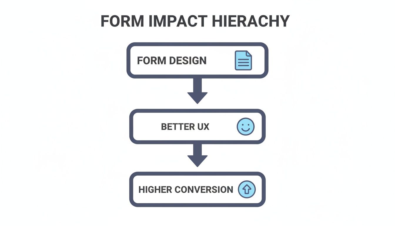
As the visual makes clear, applying form design best practices directly improves the user experience, which in turn drives higher conversion rates. This simple flow highlights why every little detail matters. Tools like AgentsForForms are built around this idea, baking these conversational principles into every template and feature. By starting with a strong foundation, you can turn any form into a powerful engine for growth and ensure every user interaction is a step forward, not a dead end.
Building an Effortless Path with Clear Layouts
Ever walked into a store where everything is just… scattered? No signs, no organized aisles, just a random jumble of products. It’s frustrating, right? You’d probably just turn around and leave. That's exactly what a poorly designed form feels like to a user. The layout isn't just about looks; it's the map that guides people from start to finish. A confusing map leads to abandoned carts, but a clear one creates a smooth path to completion.
The whole point is to lower the user's cognitive load—that's just a fancy way of saying "how hard they have to think." When a form's layout is predictable, people don't get stuck wondering what to do next. They can just focus on answering the questions, which is what we want.
Embrace the Single-Column Standard
When it comes to layouts, one column is almost always the right answer. It’s tempting to cram fields into multiple columns to save a little vertical space, but this is a classic case of form over function. Time and time again, studies show it just doesn't work.
Multi-column layouts force a user's eyes to zigzag across the page, breaking their natural top-to-bottom reading flow. It introduces a tiny moment of confusion at every step: "Which field comes next?" A single-column design, on the other hand, creates a straight, uninterrupted path. People move from one field to the next without a second thought, which means faster completion times and fewer mistakes.
Think of it as a well-organized assembly line. Each station—or form field—is in a logical sequence, letting the process flow smoothly. A multi-column layout is more like a messy workshop where you have to hunt for the next tool, slowing everything down.
Group Related Information Logically
Even in a single-column layout, organization is key. Don't just throw all the fields in a long list. Group related information into logical sections to break the form into bite-sized pieces. For instance, all the contact details—name, email, phone number—should live together in their own little block.
This technique is called chunking, and it makes a long form feel much less overwhelming. You can use simple visual tricks to make these groups obvious:
- White Space: A little extra breathing room between sections is a powerful, subtle way to separate them.
- Section Headings: Clear, simple headings like "Shipping Address" or "Payment Details" tell users exactly what to expect.
- Dividers: A simple horizontal line can work wonders to signal the end of one thought and the beginning of another.
When you organize the form this way, you’re matching its structure to how people naturally process information. It just feels right. This is a core principle behind tools like AgentsForForms, where complex forms are automatically broken down into logical steps, making data collection feel more like a conversation than an interrogation.
Use Visual Cues to Guide the Eye
Beyond the big-picture layout, small visual details can make a huge difference in guiding users. Two of the most important are how you place your labels and how you size your fields.
Top-Aligned Labels for Speed You can put labels to the left of a field, to the right, or even inside it, but the undisputed champion for usability is placing them directly on top. Eye-tracking studies have confirmed that top-aligned labels require the fewest eye movements to connect a label to its input box. This simple choice lets people scan and complete the form much, much faster.
Field Length as an Intuitive Hint The size of a field can be a powerful, unspoken instruction. A short box for a zip code and a longer one for a street address gives the user an immediate clue about what's expected. It’s a subtle form of guidance that helps prevent errors without cluttering the page with extra text. Matching the field width to the expected answer is a small touch that shows you’ve thought about the user’s experience.
Crafting Intuitive Fields That Do the Work for Users

Once you’ve established a clear path with a strong layout, it’s time to zoom in on the individual fields. This is where your users actually do the work, so your job is to make every single interaction feel light and effortless. Think of each field as a small, helpful guidepost, not a confusing puzzle.
A classic mistake is using placeholder text as a field label. Sure, it looks clean at first glance, but it’s a usability nightmare. As soon as someone starts typing, the label disappears, forcing them to rely on short-term memory to recall what they were supposed to enter. That’s a recipe for frustration, especially if they get distracted or want to double-check their answers before hitting submit.
Eliminate Unnecessary Steps with Smart Defaults
One of the best things you can do is to do the work for the user whenever possible. This is where smart defaults come in. These are pre-filled values based on information you already have or can reasonably guess about the user. Every field you can pre-populate is one less task on their to-do list, which cuts down friction and speeds things up.
It’s like having a helpful assistant who has already filled out the basic parts of a document for you. Instead of making someone scroll through a massive dropdown list to find their country, you can pre-select it based on their IP address. That small touch removes a tedious step and shows you respect their time.
Here are a few great places to use smart defaults:
- Geolocation: Pre-selecting a user’s country, state, or even city.
- Logged-in Users: Automatically filling in the name and email for a returning customer.
- Common Choices: Setting the most popular option in a radio button group as the default.
Smart defaults turn a form from a passive questionnaire into an active, helpful partner. They show you've thought about the user's context, making the entire experience feel more personal and efficient.
Choose the Right Input for the Job
The type of input field you choose has a huge impact on how easily a user can give you information. A simple text box isn't always the answer. Matching the field type to the kind of data you need makes the process faster, more accurate, and a whole lot less annoying.
For example, asking for a specific quantity is a perfect job for a stepper (the little plus/minus buttons), which gives users precise control. If you just need a value within a range, a slider is far more intuitive than asking someone to type a number. And for dates, a calendar picker is almost always better than forcing people to remember and type a specific format like MM/DD/YYYY.
Picking the right tool for the task stops errors before they can even happen. This is a core idea behind platforms like AgentsForForms, where the AI automatically suggests the best field type for each question, ensuring the user experience is as smooth as possible from the start.
Make Forms Feel Shorter with Conditional Logic
Not every question is relevant to every user. Asking someone about their children's ages right after they’ve said they don't have kids is a conversational dead-end. It’s awkward and shows you aren't listening. This is where conditional logic changes everything.
Conditional logic, sometimes called branching logic, lets you show or hide fields based on a user's previous answers. It creates a dynamic, responsive experience that feels custom-built for each person. If they select "Yes" to a question, you can reveal a set of follow-up questions. If they select "No," those fields simply stay hidden, and they can move on without a second thought.
This technique is incredibly powerful for a few reasons:
- It reduces cognitive load by only showing what’s relevant.
- It makes long forms feel shorter and much less intimidating.
- It improves data quality by preventing people from answering questions that don't apply to them.
By intelligently adapting to the user's input, you transform a rigid, one-size-fits-all form into a smart, interactive conversation that respects their time.
Designing Supportive Feedback and Error Handling
How your form handles mistakes is a defining moment. A cryptic, red error message feels like a dead end, leading straight to frustration and a closed tab. But get it right, and that same moment of friction can become an opportunity to build trust and guide someone successfully across the finish line.
The real goal is to design a system that prevents errors before they even happen and offers a gentle course correction when they do. This approach turns your form from a rigid data gatekeeper into a helpful assistant. It’s the difference between a form that yells "Invalid Input!" and one that kindly says, "Whoops, looks like you missed the '@' in your email."

Use Real-Time Inline Validation
If you do one thing to improve your form's feedback, make it this: use real-time inline validation. This simply means checking the user’s input as they type and providing immediate feedback right next to the field. It completely avoids that awful moment when a user fills out a long form, hits "Submit," and gets hit with a wall of red error text.
This isn't just about convenience—it has a massive, measurable impact. Research shows that switching from post-submit validation to an inline approach can boost success rates by 22%, slash user errors by 22%, and cut completion times by a whopping 42%. What's more, the same study found it drove a 31% spike in user satisfaction. People are just happier when the form works with them, not against them. You can discover more about these form design findings and dig into the data yourself.
Inline validation turns the feedback process into a live conversation. The form gives gentle nods of approval (like a green checkmark) or helpful pointers ("Password needs at least 8 characters") in the moment, rather than saving up all the criticism for the end.
Write Clear and Constructive Error Messages
When an error does pop up, the message you show is everything. Vague alerts like "Error" or "Invalid" are worse than useless; they just add to the user's stress. A truly great error message does two things perfectly: it clearly explains what’s wrong and tells the user exactly how to fix it.
Crafting supportive error messages is easier than you think. Just follow these simple rules:
- Be Specific: Don't just say "Invalid phone number." Instead, try "Please enter a 10-digit phone number."
- Be Human: Use plain language, not technical jargon. And please, avoid accusatory phrasing that blames the user.
- Be Solution-Oriented: Guide them to the right answer. If a username is already taken, why not suggest a few alternatives?
- Be Visually Clear: Use color (usually red), an icon (like an exclamation mark), and place the message directly beside the field that needs fixing.
How AgentsForForms Automates Supportive Feedback
Building this kind of smart, supportive feedback system from the ground up can be a real headache. This is where platforms like AgentsForForms come in, as they're designed to handle this automatically.
When you create a form, it intelligently generates validation rules and clear, human-friendly error messages for common fields like emails, phone numbers, and passwords. This means that right out of the box, your form is equipped with a feedback system that helps users get it right on the first try, dramatically reducing abandonment and improving the quality of the data you collect.
Turning Complex Forms into Simple Steps
Ever been faced with a monster of a form? You know the kind—a single, scrolling page that seems to go on forever. It feels like being asked to climb a mountain in one go. Most people will take one look at that intimidating peak and simply walk away. This is exactly why one of the most effective strategies in form design is to break that journey into a series of smaller, manageable steps.
Instead of one daunting wall of questions, a multi-step form acts more like a friendly guide. It walks the user through the process one logical chunk at a time, turning an overwhelming task into a simple, guided conversation. This small shift in presentation makes a huge difference in whether people stick around to the end.
The Psychology of Making Progress
The secret sauce behind multi-step forms is a well-known psychological principle: the endowed progress effect. The core idea is simple: we're far more motivated to finish something if we feel like we've already made some progress. A progress bar at the top of a form is the perfect way to tap into this.
Seeing that you’re on "Step 2 of 4" or that the bar is "50% complete" provides a little hit of satisfaction and encouragement. It instantly answers the nagging questions in a user's mind—"How much longer will this take?" and "Am I almost done?"—which dials down their anxiety and keeps them moving forward.
A progress bar isn't just a design element; it's a motivational tool. It frames the task as a finite, achievable journey, making users more invested in reaching the finish line.
How to Structure a Multi-Step Form
Now, creating a great multi-step flow isn't just about randomly splitting a long form in half. It takes some thought to group questions logically and build a narrative that feels natural to the person filling it out.
Here’s a straightforward way to approach it:
- Group Logically: Just as you would on a single page, group related questions together. Think of it like creating chapters in a book: one step for personal information, another for shipping details, and a final one for payment.
- Start with the Easy Stuff: Always ask for simple, low-effort information first, like a name or email. This gives the user a quick win, building momentum that makes them more willing to tackle the more demanding questions later on.
- Keep Steps Balanced: Try to make each step feel like it requires a similar amount of effort. You want to avoid a super-short step with two questions followed by a marathon step with ten. A consistent pace makes the whole process feel more predictable and fair.
When you organize your form this way, you create a clear, intuitive path that respects the user's time and mental energy.
Building Momentum with Smart Automation
Putting together these kinds of sophisticated, multi-step experiences from scratch can get complicated, fast. Thankfully, modern tools are built to handle this without a headache. For instance, a platform like AgentsForForms is designed to turn complex data collection needs into simple, guided conversations, all without needing to write a single line of code.
You can map out your steps, add branching logic that changes the path based on user answers, and automatically generate a clear progress indicator. This puts form design best practices into action for you, making sure your users get a seamless, motivating experience every time. By letting a tool handle the technical side, you can focus on what really matters: asking the right questions in the right order to guide your users smoothly to the finish line.
Using Data to Continuously Improve Your Forms
A great form is never truly “done.” It’s a living, breathing part of your user experience that can always be improved. In fact, launching your form is just the starting line. The real magic happens when you start paying attention to how people actually use it and use that data to make smart refinements.
Think of it like a conversation. You say something, then you listen for a response. Form analytics is how you listen. It tells you where the conversation is flowing smoothly and, more importantly, where people are getting stuck, confused, or just giving up. Without this feedback, you're just guessing.

Identifying Your Key Form Metrics
To start making improvements, you need to know what to measure. You could track dozens of data points, but a few core metrics will give you the most bang for your buck, offering clear insights into your form’s health.
For the most actionable data, zero in on these essentials first:
- Completion Rate: This is your North Star metric. It's the percentage of people who start your form and actually make it to the finish line. A low completion rate is the clearest sign you have a problem.
- Average Time on Form: How long is it taking the average person to fill this out? If the time is way longer than you expected, it could signal confusing questions or technical glitches.
- Field Drop-off Rate: This is where you find the exact moments of frustration. This metric tells you which specific field is causing the most people to throw in the towel. Is everyone bailing when you ask for their phone number? Bingo. You've found a critical friction point.
Turning Insights into Action with A/B Testing
Once your analytics have pointed out a problem area, what's next? You fix it. This is where A/B testing becomes your best friend. A/B testing is a straightforward experiment: you create two versions of your form—the original (A) and a variation with one change (B)—and show them to different groups of users to see which one performs better.
Think of A/B testing as applying the scientific method to form design. Instead of going with your gut, you’re using hard data from real user behavior to prove which changes actually improve your results.
You can test nearly anything, but the smartest approach is to start with changes that directly address the friction points your data has already uncovered.
For instance, if you see a huge drop-off on a required phone number field, you could run a test. Version A keeps it required, while Version B makes it optional. By measuring the completion rate for both, you'll have a clear, data-backed answer on the best path forward.
Some other high-impact elements worth testing include:
- Button Copy: Does "Get Started" outperform "Sign Up"?
- Field Labels: Is "Your Name" more effective than "Full Name"?
- Number of Fields: What happens to your completion rate if you remove one or two non-essential questions?
- Error Messages: Does a friendlier, more helpful error message guide more people to a successful submission?
Creating a System of Continuous Improvement
This data-driven approach isn't a one-and-done fix. The best teams build a continuous optimization loop: Measure, Test, Learn, and Repeat. By regularly checking your analytics and running small, targeted experiments, your forms will naturally evolve over time, becoming more efficient and user-friendly.
Platforms like AgentsForForms make this cycle much easier to manage. They come with built-in analytics that automatically track these key metrics right out of the box. The platform can even provide AI-powered suggestions, highlighting potential drop-off points and recommending changes based on proven design practices. This closes the loop perfectly, turning raw user data into a clear roadmap for building forms that don't just collect information, but drive real business results.
A Few Common Questions About Form Design
Diving into the weeds of form design can spark a few questions. Let's tackle some of the most common ones I hear, so you can put these ideas into practice with a bit more confidence.
What's The Ideal Number of Fields for a Form?
Everyone wants a magic number, but the honest answer is: ask for only what you absolutely need. Every single field you add is another little piece of friction, another reason for someone to just give up and leave.
The best way to figure this out is to do a quick "field audit." Look at each question on your form and ask yourself, "Do I really need this information to complete this specific task right now?" If not, cut it. You can almost always gather secondary details later on.
Should I Use a Single or Multi-Step Form?
This really comes down to the form's complexity. For super short interactions, like a newsletter signup or a basic contact form, a single-step design is perfect. It's quick and gets the job done.
But once you start getting into more involved processes—think registrations, applications, or checkouts with more than six or seven fields—breaking it up is a much better bet. A multi-step form chunks the process into logical, bite-sized pieces. This lowers the mental effort required and makes the whole task feel way less daunting, which almost always helps completion rates.
Takeaway: If your form looks like a wall of text at first glance, it’s probably a great candidate for a multi-step design. You want people to feel a sense of progress, not exhaustion.
Why Is Placeholder Text a Bad Label?
I see this all the time, and it’s a huge usability mistake. Using that light gray text inside a field as its only label looks clean, but it causes a ton of problems for your users.
- It disappears on input: The second someone starts typing, the label is gone. Now they have to rely on their memory to know what they were supposed to be entering.
- It makes reviewing impossible: Before hitting "submit," people can't easily scan the form to double-check their answers because there are no visible labels.
- It’s an accessibility nightmare: Screen readers often skip over placeholder text or handle it inconsistently, making the form a confusing mess for visually impaired users.
Do yourself (and your users) a favor: always use a dedicated, visible label placed right above the input field. It's a simple habit that ensures your form is clear and easy for everyone to use. Sticking to these form design best practices will pay off with better data and a much happier user base.
Ready to build smarter, higher-converting forms without all the guesswork? AgentsForForms uses AI to automatically apply these best practices, turning your ideas into production-ready, multi-step forms in seconds. Start building for free at AgentsForForms.
Article created using Outrank