Creating an Order Form That Converts: Master the Art of creating an order form
Learn practical form optimization strategies in this AgentsForForms guide: Creating an Order Form That Converts: Master the Art of creating an order form.
An order form isn't just a technical requirement; it's the final handshake in a sale. It needs to be a clear, fast, and trustworthy path for your customer to say "yes." This means carefully choosing what to ask, simplifying the entire checkout process, and embedding rock-solid payment options to kill any friction that leads to abandoned carts. The whole point is to make that last step feel like a breeze.
Is Your Order Form Silently Killing Sales?
That final click on the “Complete Purchase” button is the moment of truth. And for most businesses, it’s where a shocking number of potential sales simply vanish. We love to blame cart abandonment on big, obvious things like shipping costs, but the real silent killers are often baked right into the form itself.
Think about it from the customer's perspective. Confusing field labels, a checkout page that looks slightly sketchy, or just being asked for one too many pieces of information—these are the tiny friction points that add up and make people second-guess their purchase.
This isn't just a small annoyance; it's a massive revenue leak. Eye-opening research from the Baymard Institute shows the average cart abandonment rate is a staggering 69.82%, with overly long or complicated checkout processes being a top reason for bailing. Digging deeper, they found that forms with more than seven fields saw abandonment jump by 25%. The takeaway here is brutally simple: every single field and every extra click costs you money.
The Foundation of a Form That Actually Converts
To stop the bleeding, you have to stop thinking of your order form as a simple data collection tool. It’s a core part of the customer experience. A high-performing form really comes down to three things:
- Clarity: Use plain English and group related fields together. A customer should know exactly what you’re asking for and why, without having to think twice.
- Speed: Keep the number of fields and clicks to an absolute minimum. If you can pre-fill information, do it. For longer forms, break the process into smaller, more manageable steps.
- Trust: This is non-negotiable. Display security seals, be upfront about your privacy policy, and make your contact information easy to find. People won't hand over their credit card details if they don't feel their data is safe.
This is where AI-powered tools are changing the game. Instead of manually building a form and hoping you get it right, you can generate one from a simple prompt that already incorporates these best practices.
This approach automatically creates a clean, multi-step flow that helps you sidestep the common mistakes that send customers running for the hills.
The best way to build a form today isn't about piling on more features. It's about aggressively removing every single obstacle standing between your customer and their purchase. The less they have to think, the more likely they are to buy.
Let's break down the key components that make an order form truly effective.
Core Elements of a High-Converting Order Form
To build an order form that works, you need to focus on a few critical elements. Each one plays a specific role in moving the customer smoothly toward completing their purchase. The table below outlines these core components and why they matter.
| Element | Best Practice | Impact on Conversion |
|---|---|---|
| User-Friendly Layout | Use a single-column design, clear labels, and ample white space. | A clean layout reduces cognitive load, making the form feel faster and less intimidating. |
| Multi-Step Flow | Break the process into logical chunks (e.g., Shipping, Payment). | Prevents overwhelming the user and creates a sense of progress, reducing abandonment. |
| Minimal Fields | Only ask for essential information. Remove optional fields. | Every removed field can boost completion rates. Less work for the user equals more sales. |
| Mobile Optimization | Ensure large tap targets, readable text, and native keyboard inputs. | With over half of traffic being mobile, a poor mobile experience is a direct revenue killer. |
| Trust Signals | Display security badges (SSL), testimonials, and clear return policies. | Builds confidence and reassures the customer that their data and purchase are secure. |
| Clear Call-to-Action | Use a prominent, action-oriented button (e.g., "Complete My Order"). | The final step should be obvious and compelling, leaving no room for confusion. |
Ultimately, a truly great order form feels almost invisible. It guides the customer from adding an item to their cart to seeing the confirmation screen without causing a moment of frustration or doubt. For a deeper dive, especially if you're on Shopify, look into how you can improve your Shopify checkout experience and reduce drop-offs. This is where tools like AgentsForForms really shine, letting you generate a fully optimized form from a single sentence and avoid those costly mistakes from the very beginning.
Mapping a User-Friendly Form and Flow
A high-converting order form isn’t just about pretty buttons or a sleek design. The real magic happens before you even touch a form builder—it starts with a thoughtful plan for a smooth, intuitive user journey. The ultimate goal? Make the path to purchase feel so effortless that your customers barely have to think about it.
This means mapping out every single step, from the moment they add an item to the final thank-you page. A great form is respectful of the user’s time and only asks for what’s absolutely necessary. Long, cluttered, single-page forms are notorious conversion killers. That's why smart, multi-step flows have become the gold standard for getting people to click "complete order."
Think of your form's design as a balance of three core principles. Every decision you make should be guided by them.
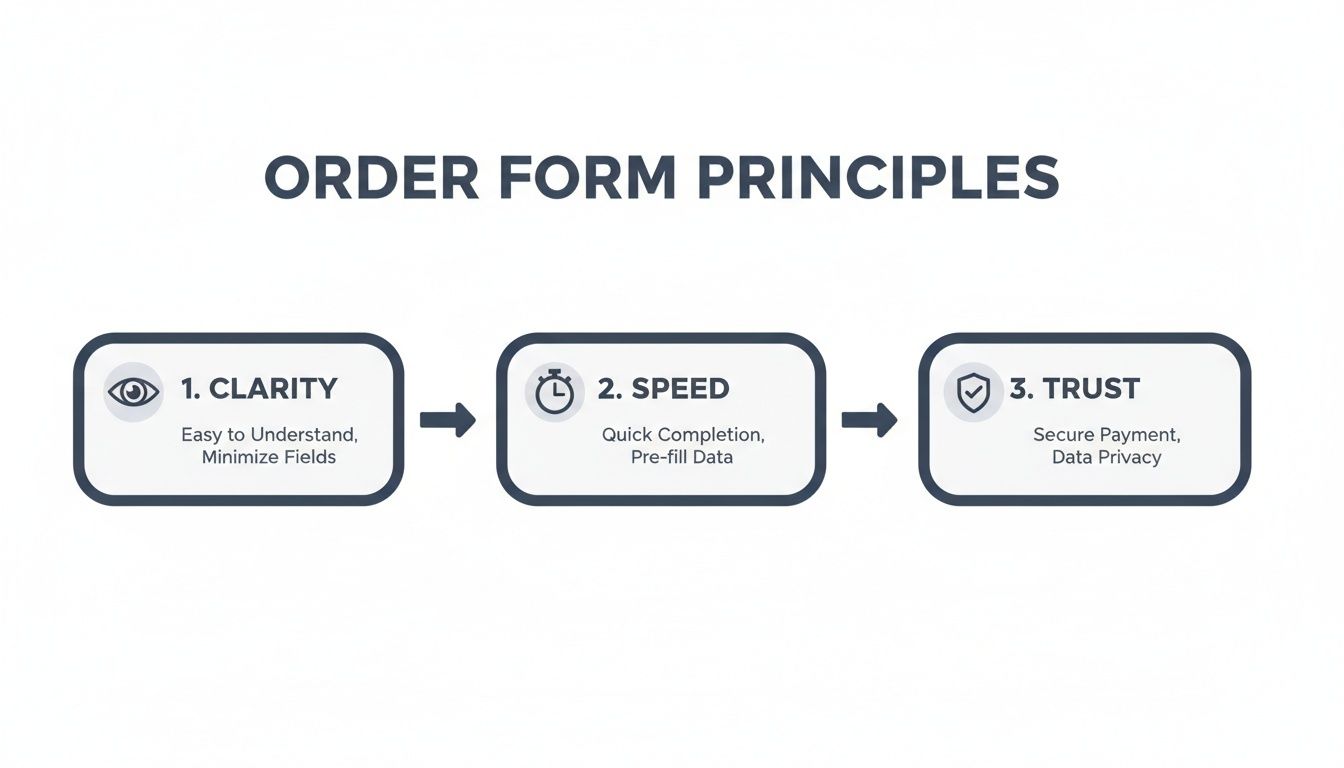
When you nail this balance, the form feels both efficient and secure, giving users the confidence they need to finish their purchase.
Structuring Different Order Types
The perfect flow is never one-size-fits-all; it depends entirely on what you’re selling. A straightforward t-shirt order is a world away from a complex B2B service agreement.
- Simple E-commerce: Selling a t-shirt? A simple three-step flow is your best friend. Start with product options (size, color), then move to shipping details, and finish with payment. Each step is a small, easy commitment.
- Configurable Products: If you’re selling something like a custom-built PC, you'll need a form with smarts. As a customer picks a processor, the form should instantly react, showing only compatible motherboards. This is called conditional logic, and it prevents errors while making complex choices feel simple.
- B2B Services: A business-to-business order might need unique fields for things like a purchase order number or separate contacts for billing and technical support. Your form's flow needs to guide the user through these business-specific requirements in a logical way.
A well-mapped form almost reads the user's mind. It should feel less like a form and more like a helpful conversation, guiding them from one step to the next without any friction.
Breaking a long process into bite-sized chunks is a game-changer for reducing user frustration. In fact, companies that switch to multi-step forms—like the kind AgentsForForms can build for you in seconds—often see conversion uplifts as high as 58% compared to those old-school, single-page behemoths. Adding a progress bar is another pro move, as it shows people exactly how close they are to the finish line.
Handling Pricing and Inventory
SKUs, dynamic pricing, and inventory management can get messy fast. If you're not careful, that complexity can spill over and overwhelm your customers. The trick is to keep the user-facing side clean while all the logic hums along in the background.
For example, if a certain t-shirt size is sold out, don't wait for the customer to find out at checkout. Disable that option right away and display a clear "out of stock" message. It’s a small detail that builds a lot of trust.
For a deeper dive into how to structure these flows, take a look at our guide on 7 high-converting multi-step form examples to boost leads. Getting this initial mapping right is the foundation of every successful order form.
Designing for Trust and a Seamless Experience

Your order form's design is more than just a pretty face—it's your digital handshake. It’s that critical moment when a customer decides if they feel secure enough to type in their credit card details. A clunky, confusing form breeds friction and doubt, which is a surefire way to lose a sale.
The bedrock of a trustworthy design is a clean, intuitive layout that works perfectly on a phone. With well over half of all web traffic now coming from mobile devices, a flawless small-screen experience isn't a luxury; it's a necessity. Think big, easy-to-tap buttons, readable fonts, and automatically pulling up the right keyboard (like the number pad for phone numbers and credit cards).
Guiding Users with Clarity and Confidence
When someone starts filling out your form, they have one goal: to finish. The best thing you can do is get out of their way. A multi-step form, for example, absolutely needs a progress bar. It’s a small detail, but it manages expectations brilliantly and keeps people from getting anxious about how much longer it will take.
Another game-changer is real-time validation. Don't wait until someone hits "Submit" to tell them their email format is wrong with a jarring red error message. Smart validation offers gentle, instant feedback as they type. It transforms a frustrating roadblock into a helpful, interactive nudge in the right direction.
Think of your order form as a helpful store clerk, not an interrogator. It should politely guide the customer, answer questions before they're asked, and make the entire process feel secure and straightforward.
This is an area where AI form builders really shine. A tool like AgentsForForms can generate user-friendly microcopy and intelligent validation rules from a simple prompt, making your form feel polished and professional right from the get-go.
The Psychology of Trust Signals
Building confidence goes beyond a clean layout. It’s about strategically placing visual cues—trust signals—that reassure customers their information is safe, right when they need that reassurance most.
Here’s where to place them for maximum impact:
- Security Badges: Pop those SSL certificates (like Norton or McAfee seals) right next to your payment fields and the final "Buy Now" button. This is where security anxiety is at its highest, and those little badges work wonders.
- Customer Testimonials: A short, punchy quote from a happy customer can be incredibly persuasive. Tucking one into a sidebar or near the bottom of the form reinforces their decision to purchase.
- Clear Privacy Reassurances: A simple, human-friendly sentence near the email field, like, "We respect your privacy and will never share your information," can make a huge difference.
For a deeper dive into creating forms that people actually want to complete, check out our guide on mastering form design best practices for higher conversions. When you combine a smooth user experience with these explicit trust signals, you get an order form that doesn’t just work—it actively converts.
Integrating Payments and Automating Workflows

When a customer clicks that final "submit" button, your work isn’t over—it’s just getting started. A truly effective order form does more than just capture data; it sets off a domino effect that fulfills the order, alerts your team, and keeps the entire operation running smoothly. This is where the right backend integrations turn a simple form into a genuine business engine.
The first and most critical connection is your payment gateway. I've seen countless businesses lose sales at the last second by sending customers to a clunky, third-party site to pay. It’s a huge source of friction, breaking the checkout flow and often feeling less secure, which is enough to make a buyer hesitate.
Instead, embed secure payment options like Stripe or PayPal directly into your form. This keeps the whole transaction on your site, reinforcing brand consistency and maintaining the trust you've worked so hard to build. If you're new to this, it's worth digging into some expert payment processing insights to understand the nuances of secure, on-site transactions.
Automating Post-Purchase Workflows
Beyond just taking the payment, your form needs to automate what happens next. Manual data entry is an absolute productivity killer. In fact, sales reps often waste up to 70% of their time on tasks that aren't actually selling. Automating this process frees up your team to focus on what really matters.
A great order form doesn’t just finish a sale; it starts the fulfillment process. The goal is to create a hands-off system where an order can go from submission to the warehouse without a single manual keystroke.
Modern AI form builders make this surprisingly simple. You can design workflows that automatically kick off a series of actions the moment an order is placed. Imagine a new submission instantly triggering all of this for you:
- Updating a Google Sheet with all the order details for real-time tracking.
- Sending a Slack notification to your fulfillment channel so the team can get started.
- Creating or updating a customer profile in your CRM with their latest purchase history.
These automated handoffs ensure every order is processed immediately and without error. You can explore the different tools you can connect with by checking out the available integrations. By building these workflows into your order form from the start, you create an efficient, mistake-proof system that can grow right alongside your business.
So, you’ve launched your order form. Pop the champagne, but don’t put the bottle away just yet. Getting your form live is a huge milestone, but the real work—and the biggest wins—are still ahead. This is where you shift from building to optimizing, turning a functional form into a high-octane conversion machine.
To get started, you have to know what’s actually happening when people land on your form. Flying blind isn't an option. Setting up analytics is non-negotiable; it’s the only way to stop guessing what your users want and start making informed decisions that actually move the needle.
Finding the Friction Points in Your Data
Before you can fix anything, you have to find the problem. Your form’s data tells a story about where people are getting stuck, confused, or just giving up. By zeroing in on a few crucial metrics, you can pinpoint these friction points with surgical precision.
A few things I always look at first:
- Completion Rate: This is your big-picture number. It's simply the percentage of people who start filling out the form compared to those who actually hit "submit." If this number is low, you know you've got a problem somewhere.
- Field Drop-off: This is where the real detective work begins. Good analytics will show you the exact field where users are abandoning your form. Is everyone bouncing the second you ask for a phone number? That’s your first and best clue for what to fix.
- Time on Field: How long are people taking on each question? If you see users pausing for an awkwardly long time on the shipping address section, it’s a good bet that the layout is confusing or the auto-fill isn't working right.
Looking at this data allows you to diagnose specific issues. For example, a massive drop-off on the final payment step might mean you aren't offering the right payment options, or maybe your page lacks the trust seals and security badges needed to make people feel safe handing over their card details.
Your form’s analytics aren’t just numbers; they are the collective voice of your users telling you exactly what to fix. Listen closely, and they’ll guide you directly to a higher conversion rate.
Using AI to Get Smarter Insights
This is where modern form builders can give you a massive leg up. AI-powered analytics, like the kind built into tools such as AgentsForForms, dig deeper than the basic metrics. They can spot subtle patterns in user behavior that you’d likely miss on your own, and even recommend specific tweaks to boost your form’s performance.
The difference this makes is staggering. A recent report found that AI-enhanced forms with built-in analytics reduced drop-offs by 33%. Much of that came from identifying major friction spots, like payment fields where a shocking 21% of users typically bail.
Here’s a quick look at the core metrics you should be tracking to get these kinds of results.
Key Metrics for Order Form Optimization
Focus on these metrics to diagnose issues and improve your form's performance.
| Metric | What It Tells You | Actionable Insight |
|---|---|---|
| Completion Rate | The overall health of your form. | A low rate signals a major issue that needs investigation. |
| Field Drop-off Rate | The specific field causing users to abandon the form. | Pinpoints the exact element to redesign or remove. |
| Time on Field | How long users spend on a particular input. | Long times suggest a field is confusing, complex, or broken. |
| Error Rate | The frequency of validation errors users encounter. | High rates mean your field labels or validation rules are unclear. |
| Conversion Rate | The percentage of form visitors who complete a purchase. | The ultimate measure of your form's business impact. |
For growth teams, this kind of focused analysis can lead to lead-gen forms that pull in 15-25% more conversions. It's solid proof that intelligent, continuous optimization is what separates a good order form from a great one. You can read more about how AI is shaping business analytics on rbcwealthmanagement.com.
By systematically tracking, analyzing, and tweaking, you can ensure your order form isn't just a part of your website—it's one of your hardest-working assets.
Taking On More Complex Orders
Simple, one-size-fits-all order forms work great... until they don't. Once you get into things like configurable products, detailed B2B quotes, or tiered event registrations, a standard form just can’t keep up. This is where you see customers get confused and carts get abandoned. The trick is to build a smarter, more dynamic form that thinks along with your customer.
This is where conditional logic really shines. Think about a customer building a custom PC. If they pick a top-of-the-line graphics card, the form should automatically hide the motherboards that can't handle it and only show power supplies with enough juice. It’s about guiding the user, preventing errors before they happen, and making a complicated decision feel simple.
Untangling B2B and Enterprise Sales
Selling to other businesses adds a whole new layer of complexity. You might be juggling thousands of SKUs, needing to show live inventory levels, or even displaying custom pricing for specific clients. A really common one is multi-user approval—a junior employee places an order, but it needs a manager's green light before it goes through.
Trying to build this stuff from scratch is a massive headache. Thankfully, modern no-code platforms make it possible to build these kinds of workflows without an army of developers. You can set up a system where submitting the form automatically sends an approval request, putting the order on hold until the manager clicks "approve."
The whole point of an advanced order form is to hide the complexity. On the backend, it's a tangled web of logic, but for the customer, it should feel like a smooth, guided conversation.
Take a company that sells promotional products, for instance. Their form could:
- Automatically adjust pricing as the customer enters higher quantities.
- Update the estimated delivery date in real-time based on how busy the production line is.
- Only show the "rush processing" add-on if the order actually qualifies for it.
Not too long ago, features like these would have required weeks of custom coding. Now, an AI-powered tool like AgentsForForms can put together these logic-heavy forms from a simple text prompt. It turns a major technical project into something any team can tackle.
Got Questions About Building Your Order Form?
You're not alone. I get asked about the nuts and bolts of creating effective order forms all the time. Let's tackle some of the most common sticking points so you can build with confidence.
How Many Fields Are Too Many?
Honestly, as few as you can possibly get away with. There's no single perfect number, but the goal is to cut every field that isn't absolutely essential to fulfilling that specific order. If you can ask for it later (like in a follow-up email), do that instead.
Each field you add is another reason for a potential customer to walk away. For most online stores, a sweet spot is somewhere between 5 and 8 fields. This keeps the process quick and painless, which is exactly what you want.
Should I Use a Single Page or a Multi-Step Form?
If your form has more than just a few fields, a multi-step design is almost always the winner. It just feels less overwhelming. Breaking the process down into smaller, logical chunks—like shipping, then billing—makes the whole thing seem much easier to tackle.
A non-negotiable for any multi-step form is a progress bar. People need to see where they are and how close they are to the finish line. It’s a small thing that makes a huge psychological difference.
What's the Single Most Important Thing for Building Trust?
Visual proof of security, without a doubt. When people are about to hand over their credit card information, they need to feel safe.
This means prominently displaying trust badges from recognized security providers (think SSL certificates, McAfee, or Norton). You should also add a small, reassuring message right next to the payment fields, like "Your transaction is encrypted and secure." Having a clear, easy-to-find link to your return policy also does wonders for calming last-minute jitters.
Ready to stop losing sales to clunky forms? With AgentsForForms, you can generate a high-converting, multi-step order form from a single sentence. Build your first form for free and see the difference.